FOMO.ai
From Confusion To Clarity: Fewer steps, more conversions, faster onboarding
We partnered with FOMO.AI to overhaul their marketing dashboard, streamlining the keyword generation workflow and introducing a scalable dual-mode system that’s expected to cut user task time by more than 50%. The result? A frictionless experience that helps users activate smarter content strategies faster.
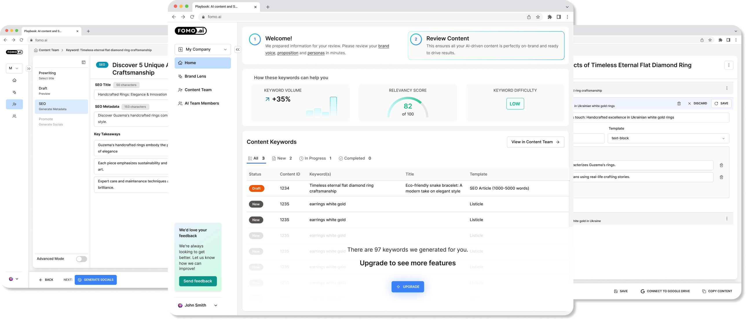
Problem 1
Users were spending too long (10 to 12 minutes) completing the essential keyword generation flow, causing friction, confusion, and lower engagement with the product.
Problem 2
Users were spending too long (10 to 12 minutes) completing the essential keyword generation flow, causing friction, confusion, and lower engagement with the product.
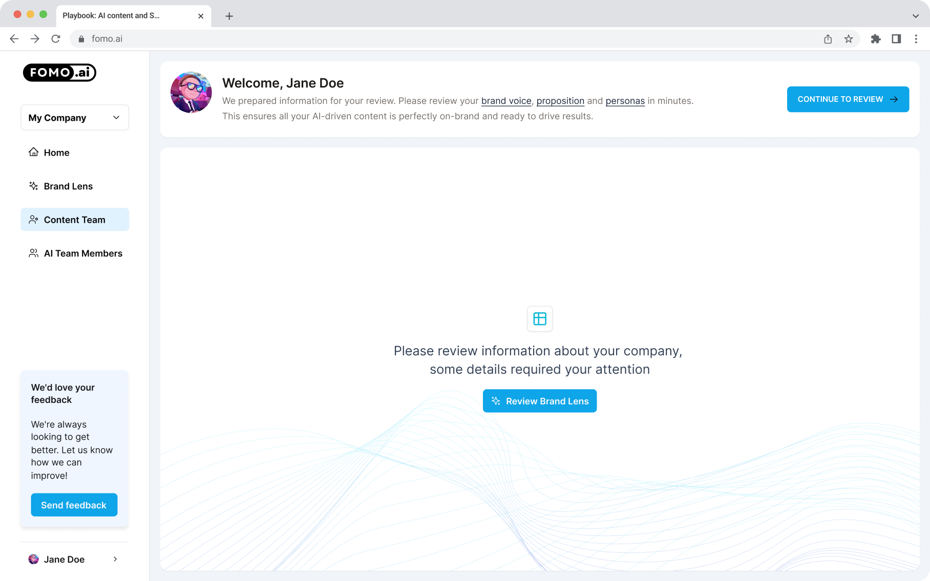
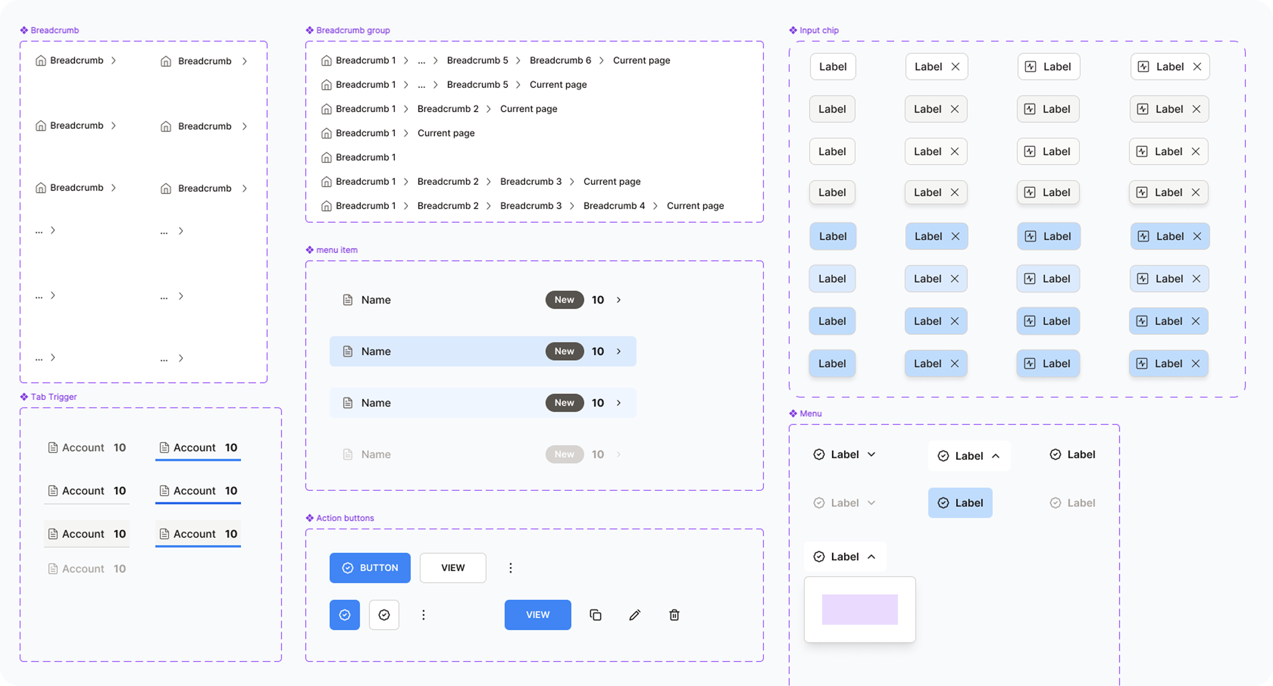
Clear Information Architecture with Sub-Navigation & Breadcrumbs
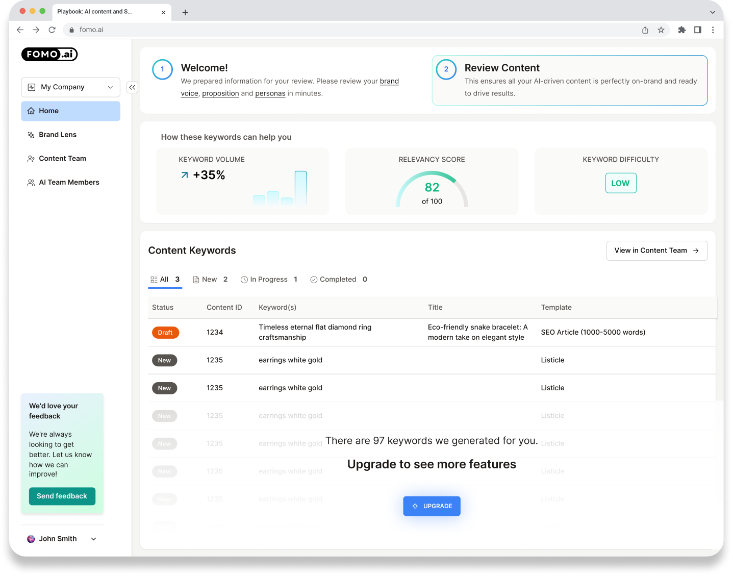
Introduced a clear sub-navigation system paired with breadcrumb trails to help users orient themselves in the flow. This improved process visibility, making it easy to understand the current step and what’s coming next.
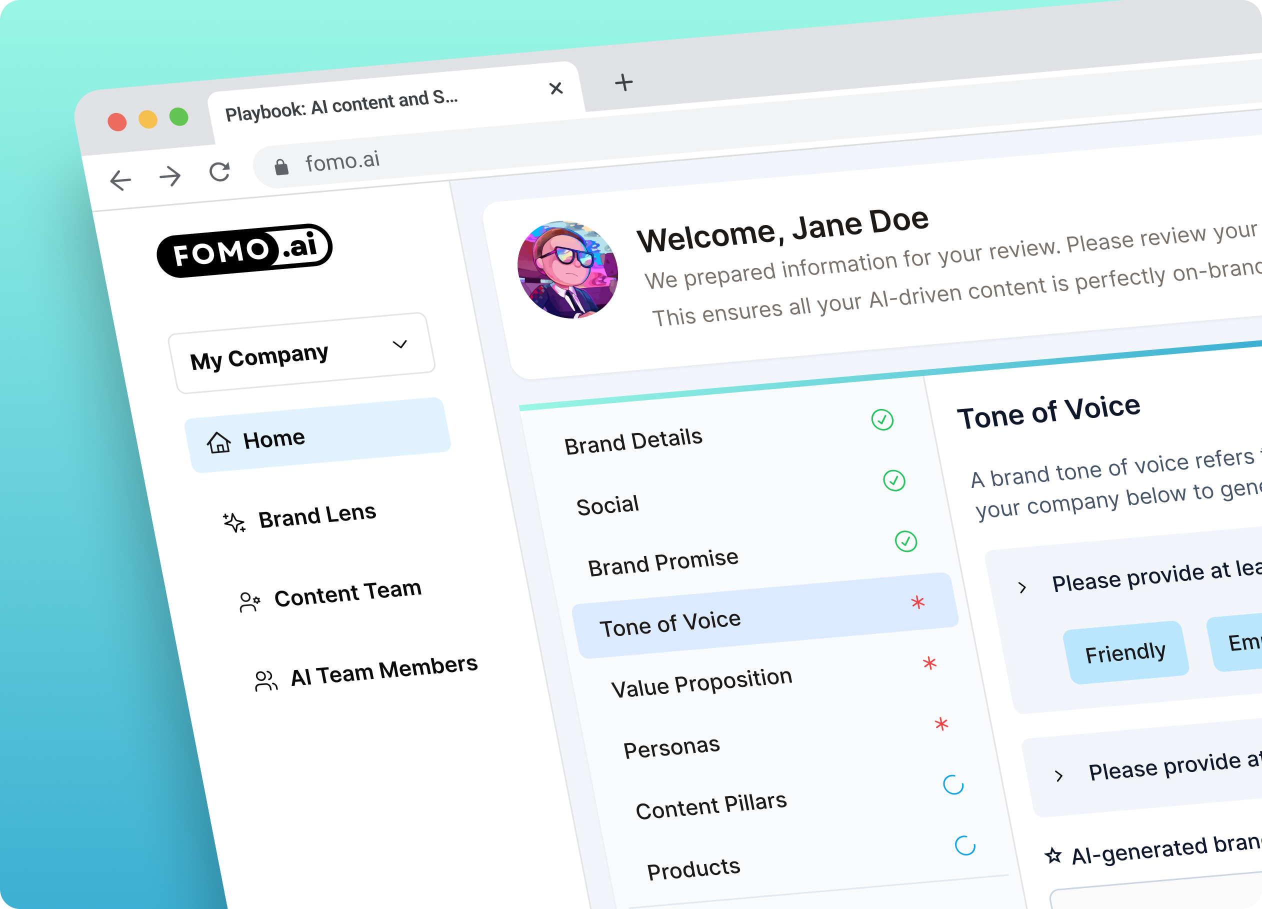
Key steps were visually emphasized, and dependencies were marked to guide users on what needed to be done first. This eliminated confusion and helped prevent users from skipping crucial parts of the process.
Clear Guidance And Wayfinding With Step Highlighting & Prioritization
Simplified & Improved Editor Page Led To More Clarity, Less Confusion
Designed a clean, focused editor interface that allowed users to clearly see the structure of their content and make real-time improvements. The editor supported both clarity and productivity.
Time-on-task reduced from ~10 minutes to less than 5
While the redesigned experience is currently being implemented, early feedback from key stakeholders has been overwhelmingly positive. The improvements to flow, navigation, and editor clarity are expected to significantly reduce user time on task-from 10–12 minutes down to the 3–5 minute target-while providing a more intuitive and scalable experience across user types.
Want to go deeper? Read the full case study.
“Work is fantastic and the whole company really thinks this will elevate our product experience. It is a strong base to build on top of, and a lot of the design system you made is pretty reusable across the app. I enjoyed working with you and appreciate that we were very flexible in terms of feedback, iteration, and working async.”

Josh Niederriter
Co-founder FOMO.ai