TopDecked
Scaled TopDecked to 1 million downloads and a 4.7-star rating
How SeaLab's updated architecture and design of TopDecked led to a 30%
increase in both user retention and conversion rates (having stayed
there since), showcasing the significant impact of the enhancements.
Problem 1
Create a unique brand positioning for TopDecked among competing
mobile and desktop applications.
Problem 2
Develop a future-proof, intuitive and cohesive design for new and
existing features that provide a seamless experience across mobile
and desktop platforms.
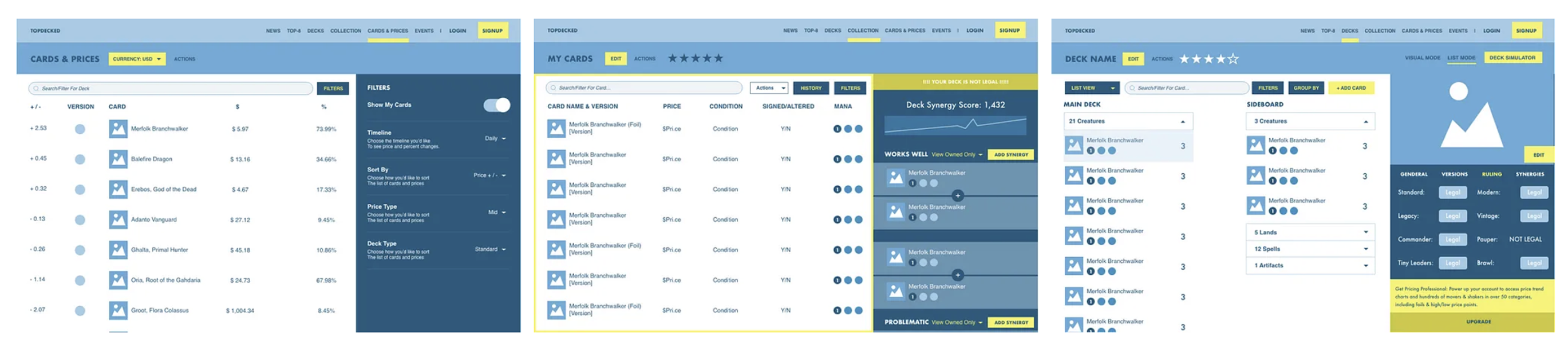
First step was taking the time to understand the intricacies of the
card game in detail. This involved not only understanding game play at
a high level, but also learning about competitors and why many players
sought out online solutions for deck management.
Understand our users by taking a deep dive into the world of Magic the Gathering
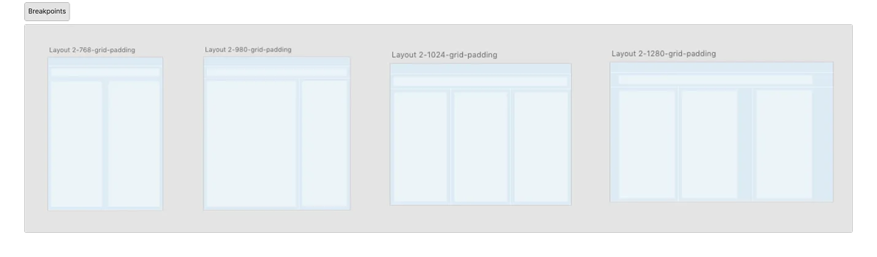
Focus on cross-platform design excellence through scalable, future-proof architecture
Our goal was to establish intuitive, consistent patterns that could be
used as TopDecked grows while maintaining visual consistency and
usability across all devices. This would ensure players could easily
navigate and enjoy the platform at home or on the go with their device
of choice, and also provide direction to Lincoln and his developers
for implementing additional features in the future without requiring a
design team to help expand.
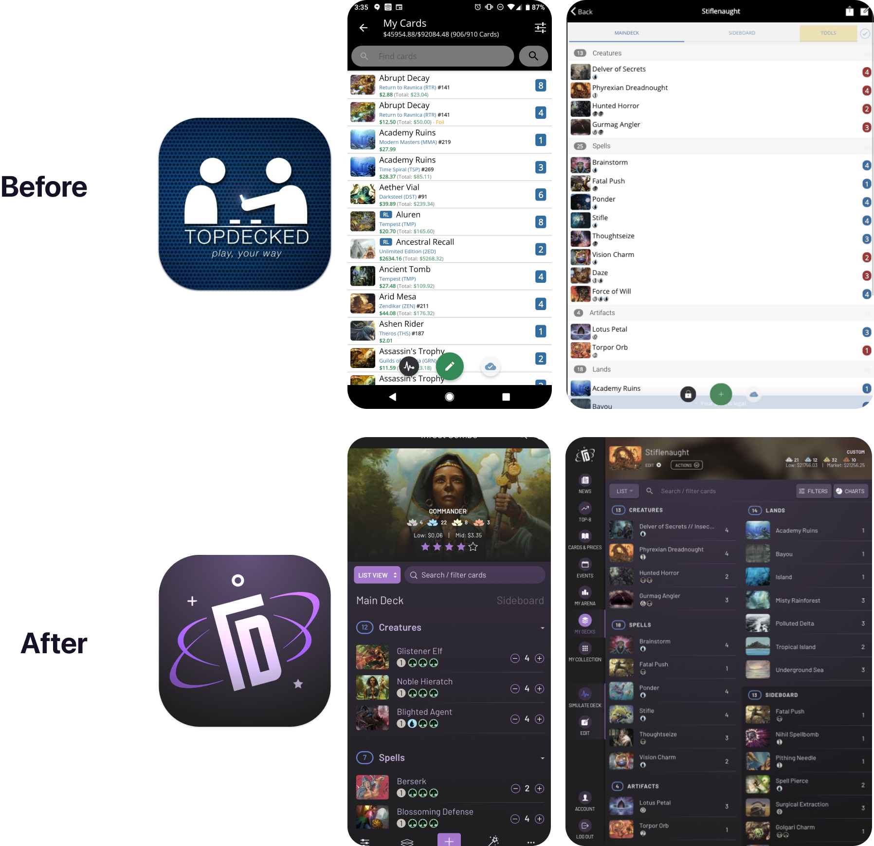
While iterating on logos and waiting on community feedback, we
performed an assessment of the TopDecked application and identified
current colors, inconsistent elements, and other components currently
in use. We used these as a jumping off point not only in creating our
design system deliverable, but also in finding color palette and
redesign options without losing any of TopDecked’s functionality.
Crafting a distinct and memorable brand identity to stand out in a crowded space
Engaging and accessible experience
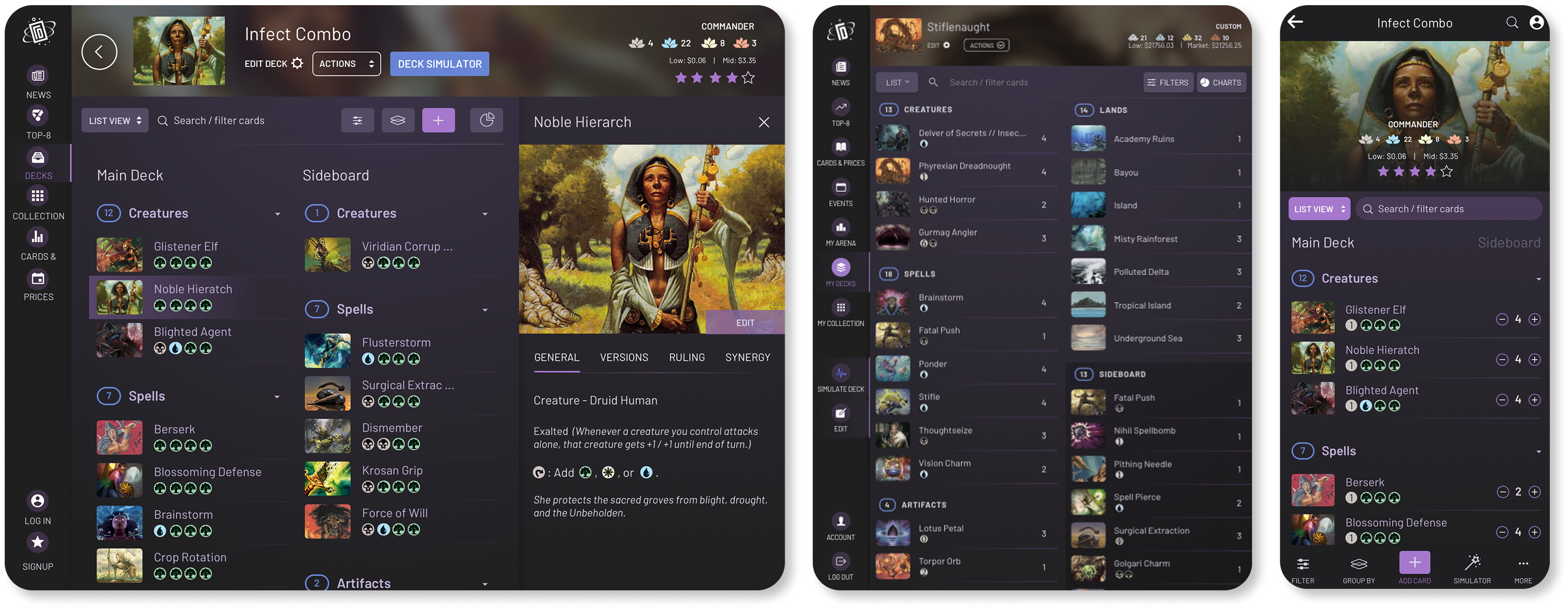
With our brand established, we moved to high-fidelity creation and
brought our wireframes to life with accurate product data and card
information. We prioritized creating an inclusive and accessible
interface with features, and an experience that caters to both new and
expert players. Throughout the design process, SeaLab utilized
Lincoln’s connection to his community to gather ongoing feedback, and
iterate on the go.
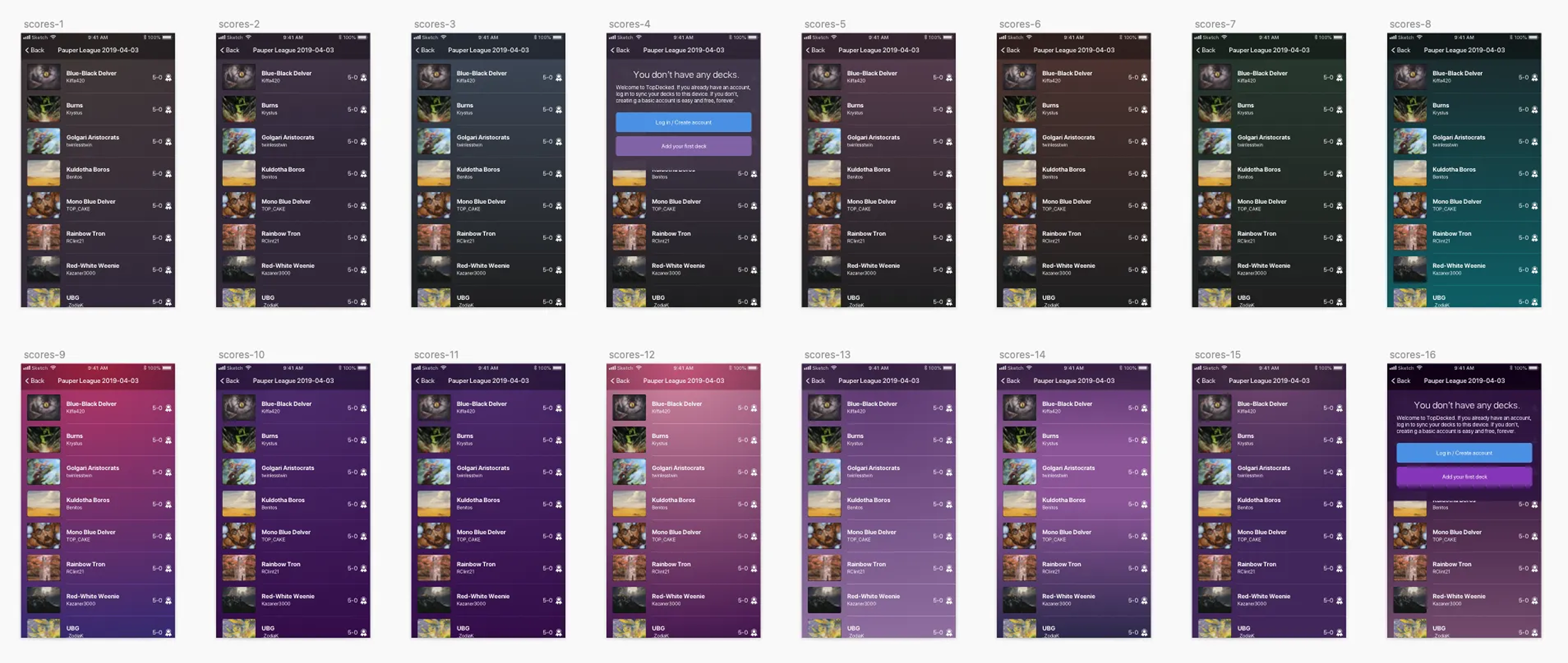
Updated architecture and design led to a 30% increase in user retention and conversion rates
We watched TopDecked’s app rating maintain a strong presence on the
Google Play Store, with a temporary dip from 4.6 stars to 4.1 after
the UI update, a common reaction to change. However, after
addressing user concerns, the rating quickly rebounded to an
impressive 4.7 stars. The updated architecture and design led to a
30% increase in both user retention and conversion rates (having
stayed there since), showcasing the significant impact of the
enhancements.
Want to go deeper? Read the full case study.
Hands down the best MTG companion out there — and honestly, the only one you need. Beautiful, full-featured, and constantly improving. From deckbuilding to price tracking, it does it all — and the dev is incredibly responsive and helpful. Worth it.

Brian Hamilton
TopDecked User