When you commission a UX audit service, you're paying for a structured, evidence-backed evaluation of where your product is with the people it's supposed to serve in mind. Basically, a clear map of what to fix first, why, and how. You definitely should not pay for someone's subjective opinion about your product.
The problem is that "UX audit" gets used loosely. Some shops deliver a slide deck of screenshots with vague suggestions. Others hand you a 60-page report that's difficult to act on. Neither is worth what you paid, in our humble opinion.
A real audit includes a clear and prioritized list of usability problems, a severity assessment ranking issues by their impact on user experience and business outcomes, an estimation of the effort required to resolve each issue, and practical recommendations for improvement.
Here are the 10 things you should expect from any credible UX audit agency. Use this list to vet vendors, set expectations with your team, and make sure the work you're paying for moves the needle.
1. Heuristic Assessment in a UX Audit
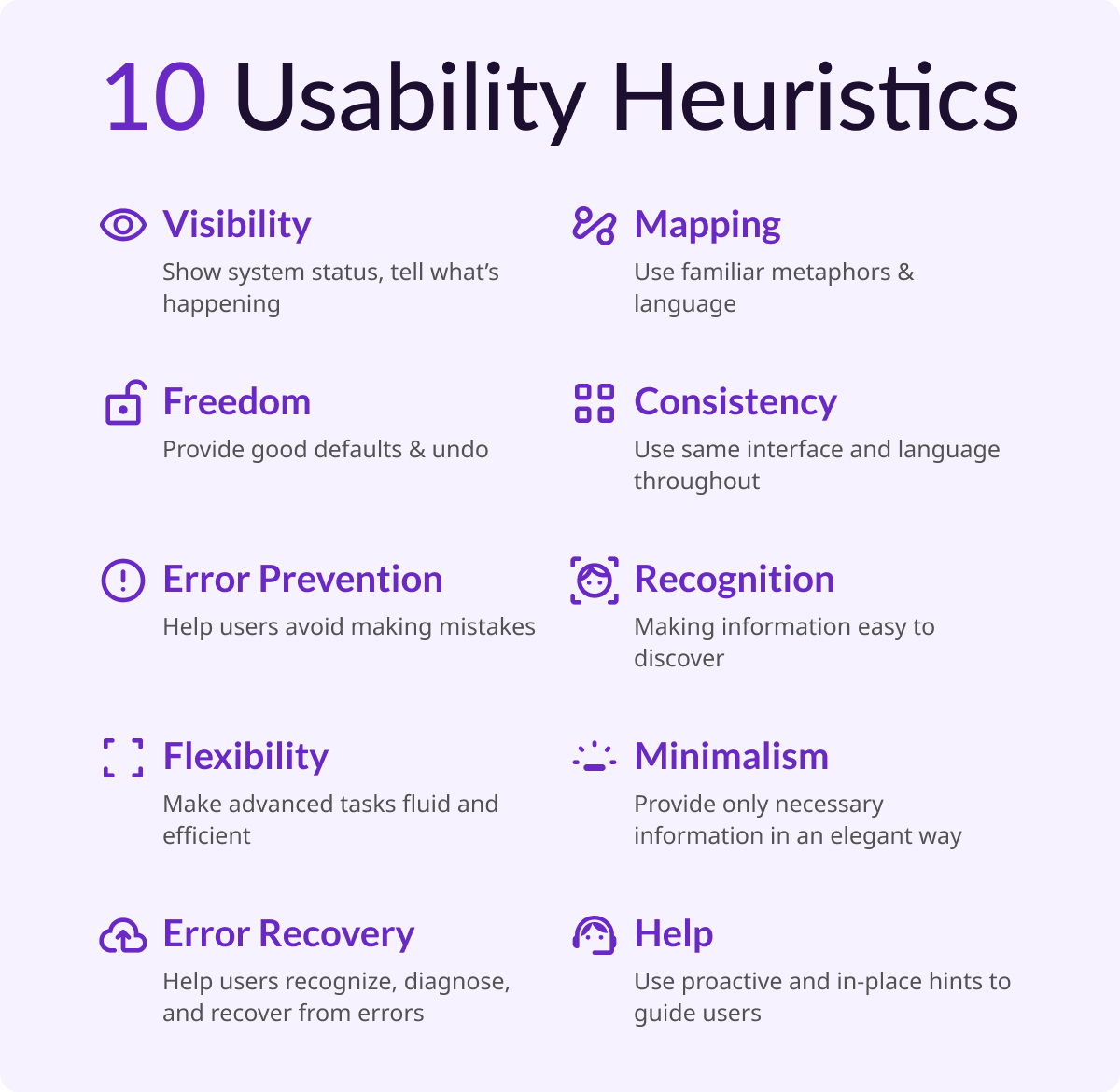
This is the methodological backbone of any credible audit. Jakob Nielsen's 10 general principles for interaction design form the basis for many UX design audits. Developed in the early 90s, Nielsen's heuristics outline a broad set of rules of thumb, rather than rigid guidelines, that auditors use to identify interaction design failures.
In practice, this means a trained auditor walks through your product screen by screen, flagging violations such as unclear system status, inconsistent design patterns, error messages that don't help users recover, and confirmation dialogs that create unnecessary friction.
These findings are tied to specific heuristics, which makes the feedback actionable and defensible, not subjective.
A modern UX audit in 2026 goes beyond the 10 classic heuristics. It's important that the audit incorporates WCAG 2.2 accessibility standards, technical performance, and dark pattern detection. A vendor who only runs heuristics without layering in these dimensions is giving you an incomplete picture.
Key deliverables to look for in an assessment:
- Annotated screenshots.
- Heuristic referenced for each violation noted.
- A severity rating for each violation.
2. User Flow Analysis in a UX Audit
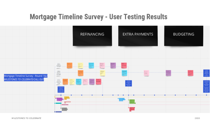
User flow analysis is to understand how users navigate through a product and specifically where they get stuck. By mapping out key interactions and user decision points, you can uncover inefficiencies and potential pain points. Often, user journey maps are created to visualize how users interact across different touchpoints.
This part of an audit is intended to generate deeper insights. Because, you're not just asking "does this look right?" You're asking "can users accomplish tasks without encountering frustrating friction or complete blockers?" For AI-powered SaaS products especially, this is where audits surface the most critical problems such as unclear output states and essential tasks left incomplete, usually resulting from a disconnect of system setup and user intent. These problems create moments where trust and user buy-in erodes.
Key deliverables to look for in user flow analysis:
- Annotated flow diagrams showing where users stall, drop, or backtrack.
- At minimum, 3-5 highest-friction moments in your primary user journey.
3. Quantitative Data Review
Analytics should pinpoint exactly where all of your current users are struggling. To get a complete picture, auditors should find as much quantitative data as possible (including access to tools like Google Analytics, Hotjar, Amplitude, Mixpanel, or Microsoft Clarity) as well as any existing persona files, metric reports, and conversion funnels the team uses internally.
This includes session replays and heatmaps to understand user interactions, and usability tests to identify issues and collect qualitative feedback. When audit findings map directly to real usage data (such as a heuristic violation that corresponds to a known drop-off point) you get findings your engineering team can justify prioritizing.
Key deliverables for quantitative data reviews:
- Data callouts embedded alongside heuristic findings, not siloed in a separate section.
Findings without data are hypotheses. Findings with data are evidence.
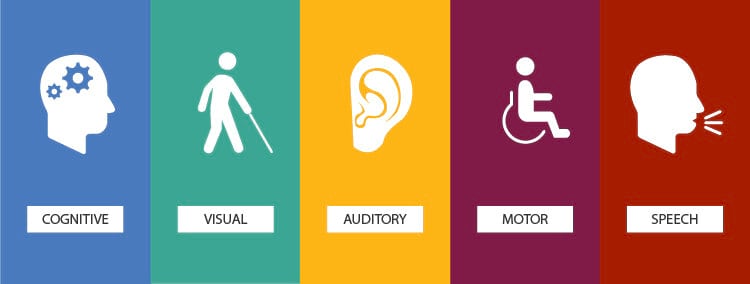
4. Accessibility Evaluation
Accessibility is a vital factor in ensuring a product is inclusive for all users. Auditors need to consider whether the color palette, fonts, and components serve users with visual impairments, and whether the product allows users to switch between light and dark modes to accommodate users with sensitive eyesight.
Beyond visual impairments, a complete accessibility review covers keyboard navigation, screen reader compatibility, touch target sizing for mobile users, and color contrast ratios against WCAG 2.2 AA standards. This isn't just a compliance checkbox. Accessibility issues routinely affect 15-20% of any user base, and many of the fixes that help users with disabilities improve the experience for everyone.
Key deliverables for accessibility evaluations:
- Specific WCAG criteria referenced per issue.
- Contrast ratio scores.
- A list of components that fail keyboard or screen reader testing.
5. Information Architecture and Navigation Review
Auditors should inspect how a product is structured, whether navigation is intuitive and whether users can find what they need without getting lost. Tree tests or card sorting may be used to validate assumptions about how users expect content to be organized.
For most products, IA problems are invisible until someone outside your team tries to use the product cold. Labels that make sense internally don't always match how users think. Navigation patterns that worked at 10 features start to buckle at 40. This section of the audit catches those structural issues before they become a reason users churn.
Key deliverables for IA and navigation reviews:
- Annotated sitemap or navigation audit.
- Specific labeling or hierarchy recommendations.
- If applicable, results from any tree testing or card sorting conducted.
6. Forms, Inputs, and Interactive Component Review
Auditors should examine all forms, inputs, and interactive components for usability, responsiveness, and ease of completion with particular attention paid to error states, validation messages, and whether users can recover from mistakes without friction.
This is consistently one of the highest-leverage areas of a UX audit. Forms are where intent becomes action and where broken UX creates the most direct business impact. If your checkout, onboarding, or AI feature configuration flow has bad error handling or confusing field labels, users won't complete it. The fix is rarely expensive, but the audit has to surface it first.
Key deliverables for reviewing action-based components:
- A component-by-component review of your primary forms.
- Annotated recommendations.
- Within forms, focus on error states, inline validation, and field-level clarity.
7. Severity-Rated Issue Log
A professional audit doesn't dump 60 findings on you and call it a day. Issues should be categorized and prioritized with a focus on user pain points — the problems most likely to negatively impact engagement and performance — so teams know where to focus first.
Most audits use a three- or four-tier severity scale: critical (blocks task completion), high (creates significant friction), medium (degrades experience but users can work around it), and low (polish-level issues). This structure transforms the audit from a list of complaints into a prioritized repair queue. Your engineering team should be able to open the issue log and immediately understand what to fix in the next sprint versus what goes in the backlog.
Key deliverables for severity-ratings:
- A sortable, tagged issue log with severity, affected screen or flow, heuristic reference, and recommended fix per item.
What This Looks Like in Practice: A Redacted SeaLab Example
Below is an excerpt from a SeaLab UX audit delivered for an AI workflow product. Details have been redacted to protect the client.
Client context: B2B SaaS product. AI-assisted recommendation engine embedded in an existing dashboard. Team suspected low adoption was a model quality problem.
| # | Issue | Severity | Heuristic | Recommended Fix |
|---|---|---|---|---|
| 07 | AI output displayed without confidence indicator or explanation | Critical | H1: Visibility of system status | Add a brief reasoning summary ("Based on X, we recommend Y") + confidence tier label |
| 12 | No error state when AI recommendation fails to generate | Critical | H9: Help users recognize, diagnose, recover from errors | Implement explicit fallback state with manual override option |
| 19 | Accept/reject actions are unlabeled icon buttons | High | H4: Consistency and standards | Replace with labeled text buttons; confirm destructive actions |
| 23 | Mobile: action buttons fall below visible viewport on recommendation cards | High | Mobile responsiveness | Pin action buttons to bottom of card regardless of content length |
| 31 | Recommendation history accessible only via settings > account > history | Medium | H6: Recognition rather than recall | Surface recent recommendations in main dashboard sidebar |
Stakeholder hypothesis: Model quality was causing abandonment.
Audit finding: Users weren't abandoning because they distrusted the model. They were abandoning because they couldn't tell what the model had done or what they were supposed to do next. The flow had no feedback states, no explanatory copy, and no recoverable error handling.
Recommended next step: Key Flow Redesign sprint focused on the recommendation delivery and action sequence. Estimated: 3 weeks. No model changes required.
This is what a targeted audit enables: a scoped fix, not a six-month overhaul.
For a look at how this kind of audit led directly into a SaaS redesign, see our UX overhaul of the FOMO.ai dashboard.
8. Stakeholder Alignment Summary
Before a UX audit begins, stakeholder alignment ensures the audit is grounded in reality, not just best practices. Product managers think about conversion rates and upcoming launches. Designers may have concerns about usability or inconsistencies in UI patterns. A professional auditor captures that context at the start and reflects it back in the final deliverable.
The stakeholder summary documents what each key stakeholder identified as the primary problem, where there was alignment, and where there was disagreement. This matters because audit findings sometimes confirm stakeholder suspicions — and sometimes they don't. When they diverge, you need a record of the original hypotheses to understand why.
Key deliverables for stakeholder alignment:
- A short written summary of stakeholder inputs.
- The audit's stated goals as agreed upon at kickoff.
- A note on scope decisions made based on those conversations.
9. Mobile and Responsive Experience Review
Mobile experience is a crucial consideration, given how many people use mobile devices for browsing and product interaction. A UX audit that only reviews the desktop experience is incomplete for almost any product built today.
This section evaluates touch target sizing, scrolling behavior, load performance, and whether any critical interactions become inaccessible or degraded on smaller screens. For SaaS products with AI features specifically, output-heavy interfaces that work fine on desktop often become unusable on mobile — long responses with no truncation, action buttons that fall below the fold, or progressive disclosure patterns that break entirely.
Key deliverables for mobile reviews:
- A dedicated mobile review section (not just a footnote).
- Specific device or viewport ranges tested.
- Annotated screenshots from mobile testing.
10. Prioritized Recommendations and a Defined Next Step
The most important thing a UX audit delivers isn't the list of problems. It's clarity on what to do next. An action plan should include specific, practical suggestions for improvements and fixes tied directly to audit findings.
A good recommendations section doesn't just say "improve the onboarding flow." It says: "Remove the three-step email confirmation sequence before users reach the dashboard. Replace with a single inline prompt on first login. Expected impact: 15-25% reduction in drop-off between signup and first session." The specificity is the value.
Alongside individual recommendations, the audit should give you a defined next step: a sprint scope, a design exploration, a usability test to validate a hypothesis, or an engagement recommendation. A UX audit has clear deliverables and measurable impact — and it should tell you whether a sprint is enough or whether a deeper engagement is warranted.
Key deliverables for recommendations:
- A recommendations section tied 1:1 to the issue log.
- A "recommended next step" section that proposes a concrete scope of work — not an open-ended retainer pitch.
SaaS UX Best Practices: What a Good Audit Changes
For SaaS products specifically, the audit findings above tend to cluster around a few recurring patterns: onboarding flows that lose users before they hit their first value moment, dashboard layouts that work for power users but confuse everyone else, and AI features that generate outputs users don't know what to do with.
The saas ui ux design issues that show up most often aren't the flashy ones. They're the quiet friction points: an error state that was never designed, a label that made sense to the engineer who wrote it, a mobile layout that was tested once and never revisited. A UX audit finds all of it — and tells you which ones are costing you users right now.
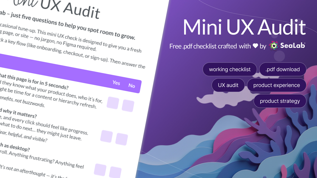
Download: The SeaLab UX Audit Readiness Checklist
Before you bring in an external auditor — or hand your team this ux audit checklist framework to run internally — use our one-page checklist to prepare.
It covers what data to pull, who to include in the stakeholder kickoff, how to scope the audit to avoid sprawl, and what to ask any vendor before you sign.
Download the UX Audit Readiness Checklist!