How we evolved the Evo Design System to unify 10+ enterprise web applications and extend it to mobile (in one year!).
Project Overview
Eptura (a global worktech company with an ecosystem of 10+ products) relies on the Evo Design System to drive consistency, efficiency, and scale across web and mobile. As the lead UX designer, we steered the system through a critical growth phase: refining the web framework, integrating it across more than ten enterprise apps, and later extending it to mobile.
Working across diverse governance models and tight resources, we built a versatile, scalable ecosystem that meets product needs while preserving a shared design language.
Challenges
- Component convergence: Identify and prioritize unique and shared components across 10+ web and mobile apps.
- Constraints and complexity: Navigate resource limits and technical intricacies without slowing delivery.
Confidentiality note: Certain details are intentionally generalized or reinterpreted to honor NDAs.
End Results
- System expansion: Refined the web design system (including token management) and mirrored it for mobile to ensure cross-platform parity.
- Theming at scale: Implemented light and dark themes to improve accessibility, preference support, and overall UX.
- Governance & process: Introduced governance strategies and optimized workflows to maintain consistency, theme management included.
- Legacy alignment: Integrated legacy products and ensured compatibility with new themes, modernizing interfaces without disrupting function.
- Enablement: Produced comprehensive documentation and training for component use, theme customization, and implementation.
- Recognition: Earned award nominations for innovative system and theme work focused on accessibility and user satisfaction.
The Solution
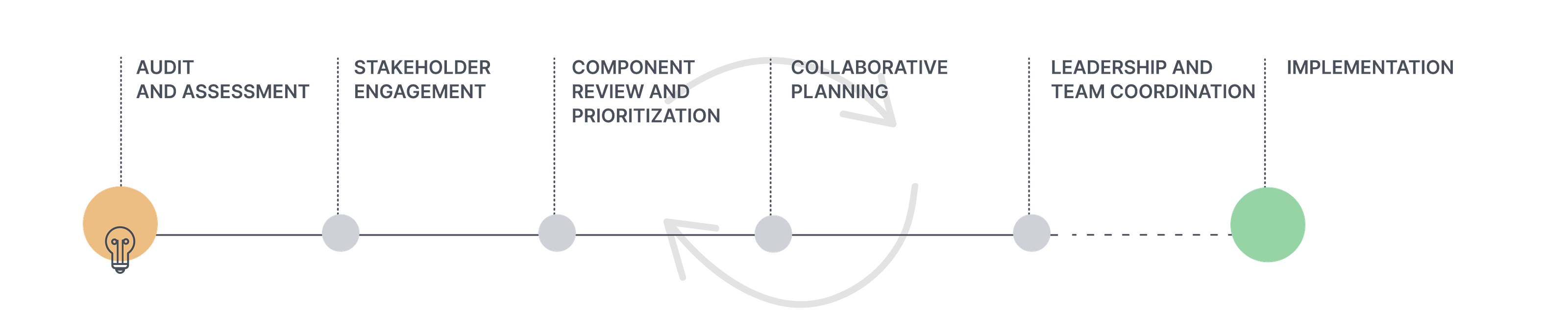
Audit & Assessment
Eptura partnered with Concrete UX to audit each product in the ecosystem. Their high-level usability evaluation (navigation, structure, engagement, first-use impressions) informed the next iteration of Evo and recommended a deeper heuristic review for task-level issues.
Product strengths to leverage:
- Archibus / OnSite : Actionable dashboard views that surface useful data.
- ManagerPlus: Strong data visualization patterns to inform cross-suite improvements.
- Archibus Workplace: Intelligent defaults and a light, efficient form aesthetic.
- iOFFICE: Approachable visual language; a foundation for navigation and workflow refinement.
- Serraview: Robust floor plan and space management with clear guidance and error prevention.
- SiQ: Space-efficient navigation offering new patterns for wayfinding.
- Teem: Well-executed navigation, wayfinding, and clear system status cues.
Eptura's Product Suite
Serraview, Before, After
Serraview before desktop image showing primarily a navy blue and white interface with some dated grays
Serraview after screenshot showing various desktop images all white and blue and looking uniform
Condeco, Before, After
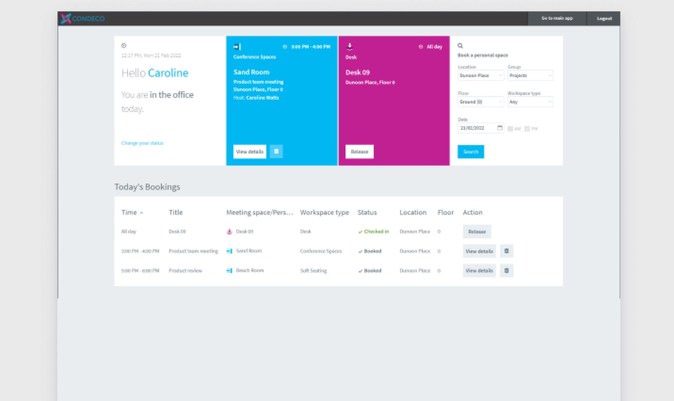
Condeco before desktop image showing dated grays and very boxy grids
Condeco after image showing clean white design matching the after images above
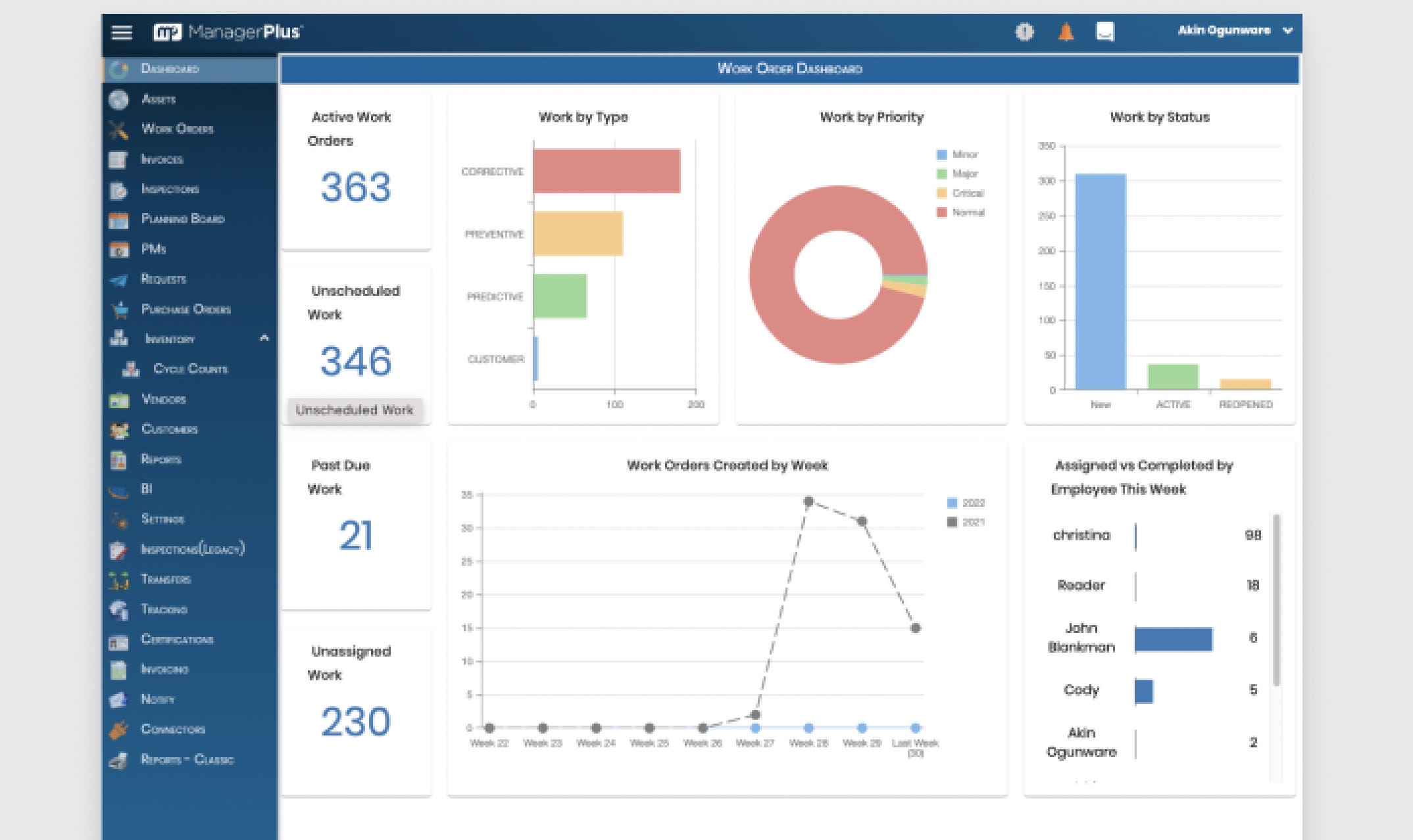
ManagerPlus, Before, After
ManagerPlus desktop image before the design system update - mostly blue and looking date
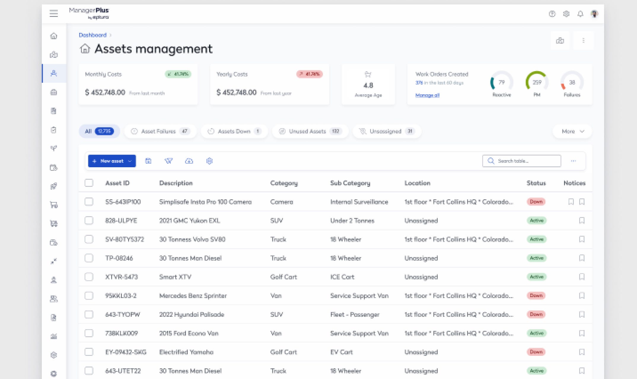
ManagerPlus after the design system updates - very white and clean with a table visible that's easy to scan
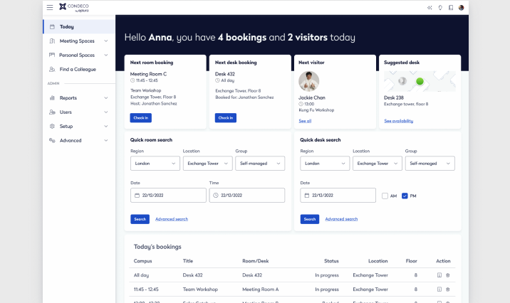
Engage (Mobile), Before, After
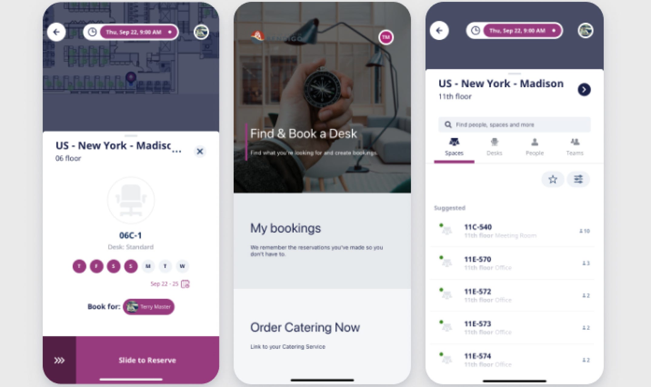
Engage mobile designs before - showing magenta and gray colors along with white
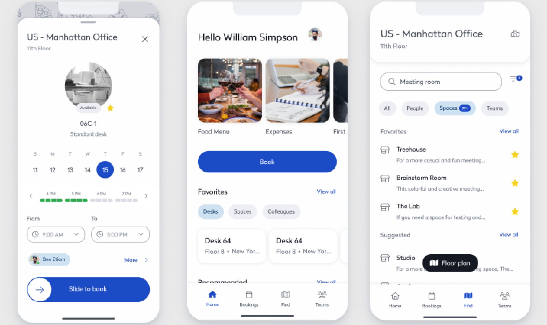
Engage mobile designs after updates showing clean white components and matching designs to desktop "after" images
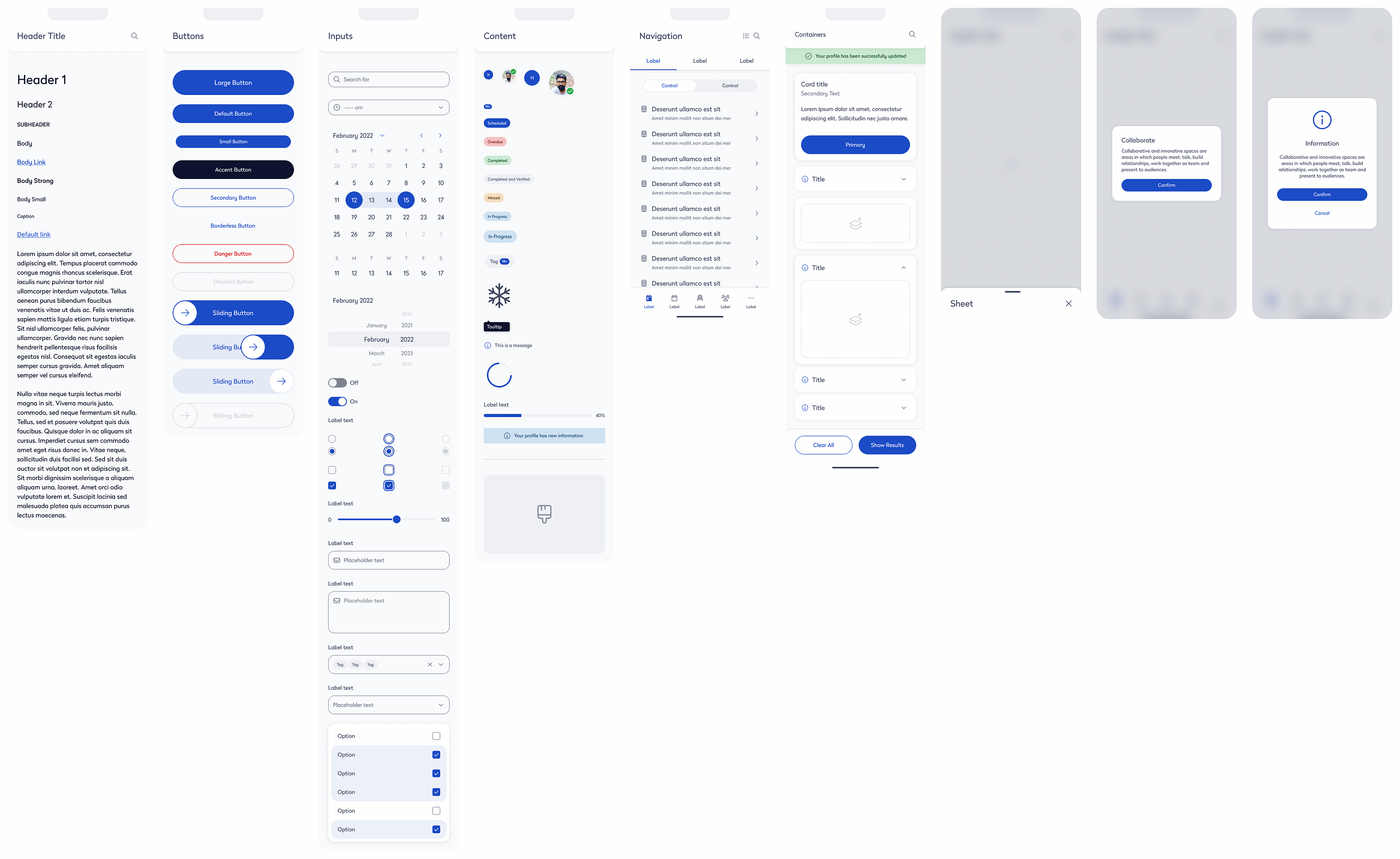
Component Review and Prioritization
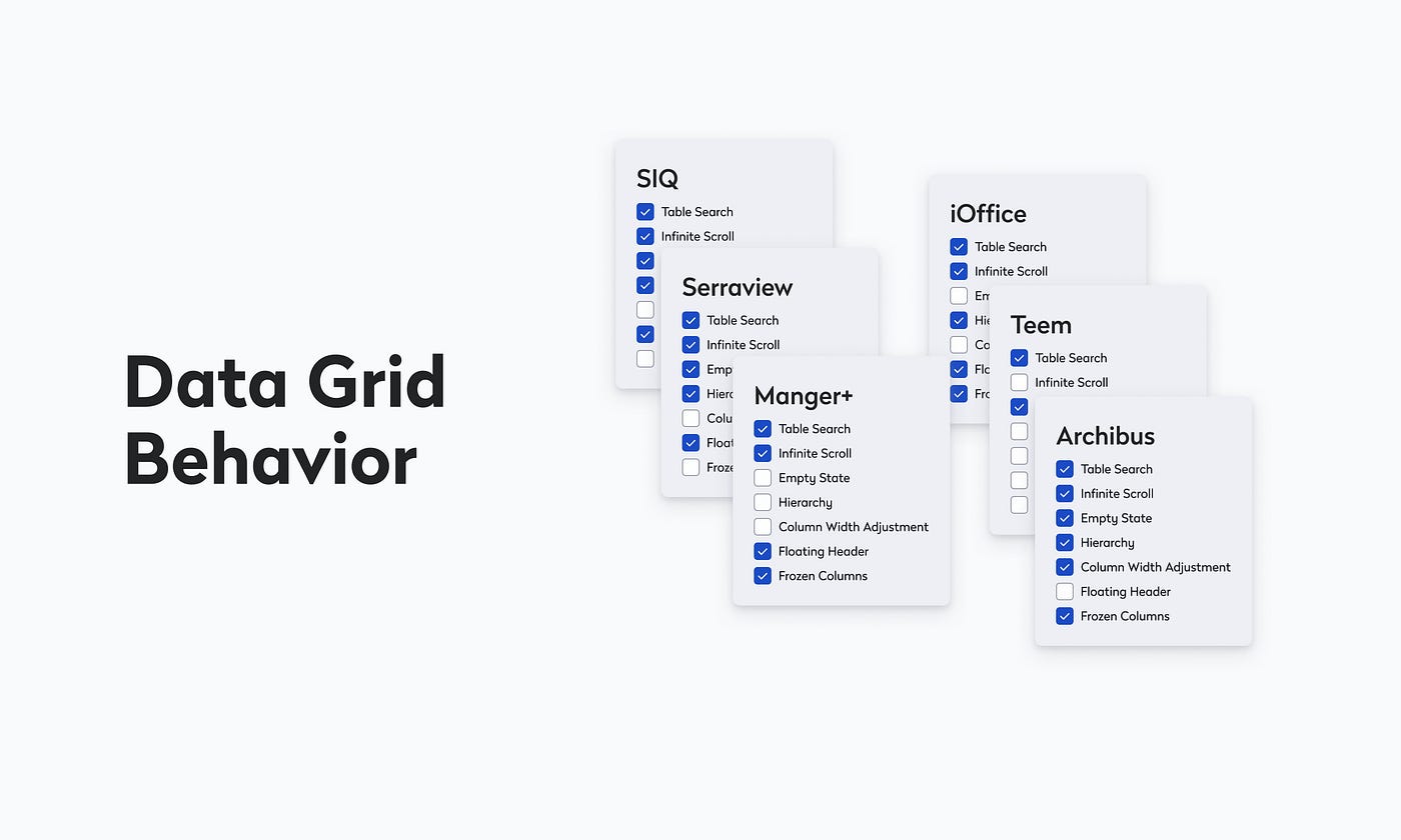
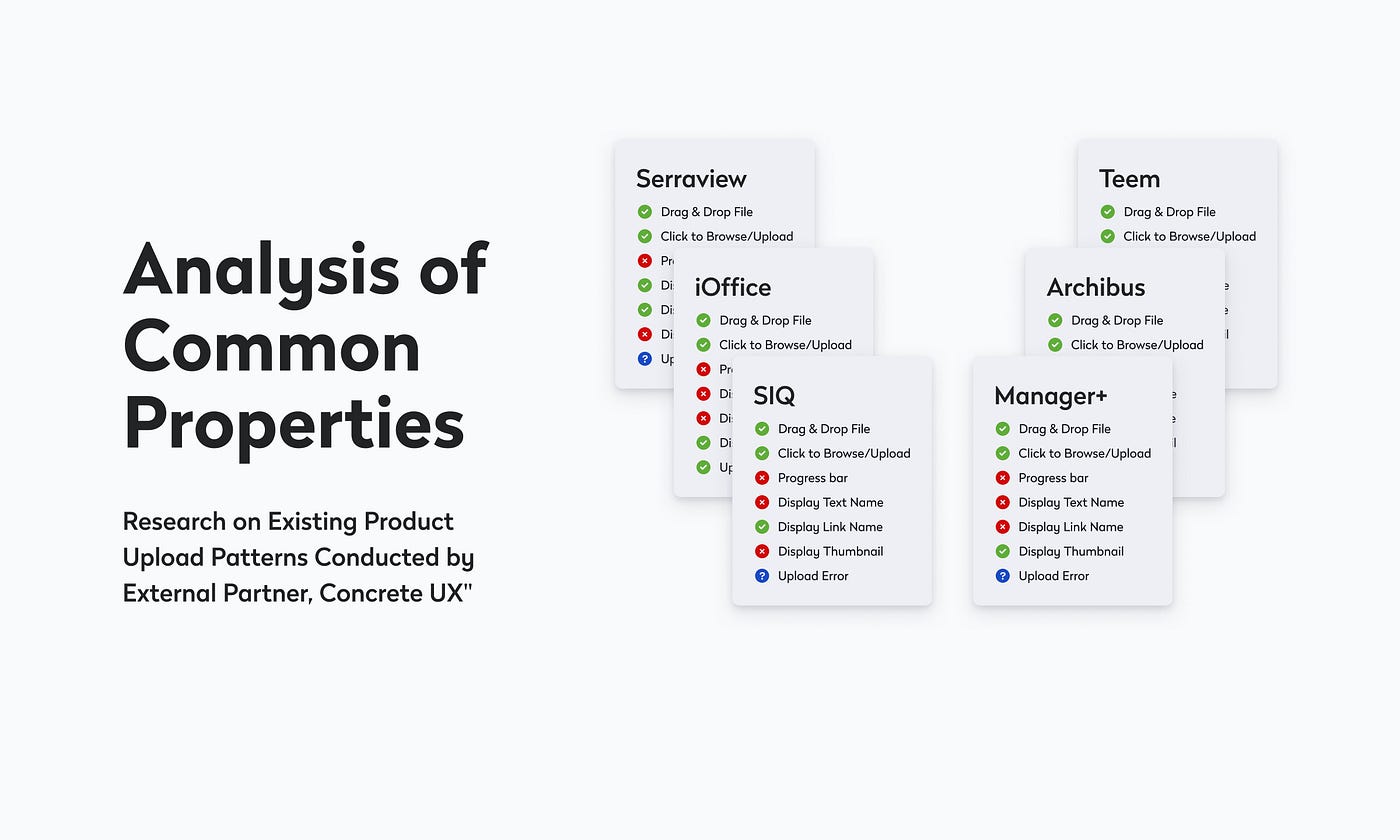
We inventoried and documented existing components across web products, with deep dives on complex patterns such as tables/data grids. In partnership with UX research, we evaluated functional requirements and usage contexts, then prioritized components by user impact and team timelines.
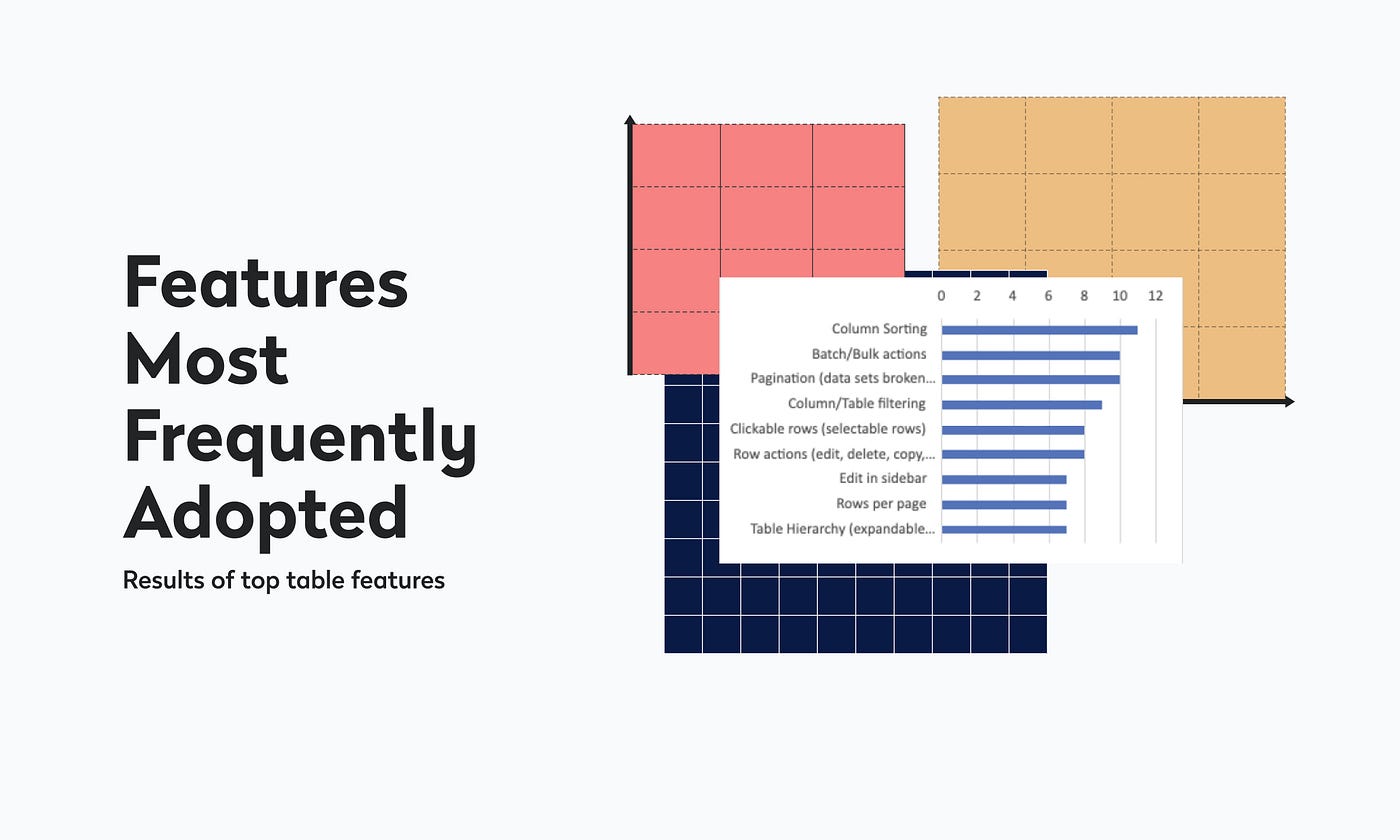
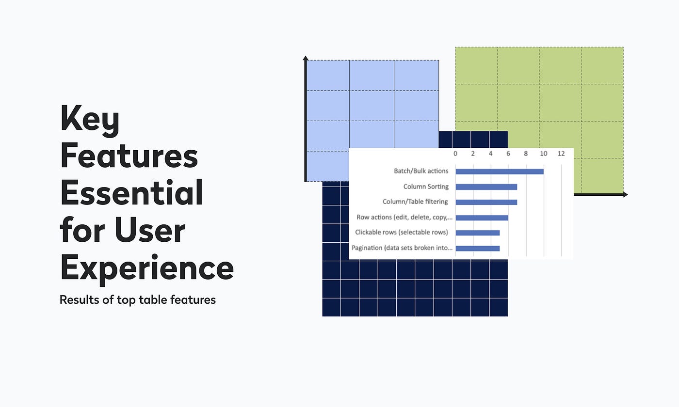
Research highlights:
- Top features within the table component (sorting, filtering, inline edit, column config).
- Data-grid behaviors and their UX impact across products.
- Patterns and friction in file upload workflows.
Collaborative Research: Understanding Top Features Utilized Within Table Component through UX Research
Collaborative Coordination
- Kickoff & roadmap: Co-created a system roadmap with the VP of UX, lead UI dev, engineering manager, and BA, aligning component needs to product priorities.
- Bi-weekly product syncs: Stayed close to evolving roadmaps and constraints across PMs, BAs, and UX designers.
- Daily design-system standups: Authored user stories, defined use cases, and ran two-week sprints to keep delivery predictable and transparent.
- Reflections and Roadmap
Implementation & Execution
We executed a staged rollout: breaking work into manageable increments, collaborating closely with engineering, and validating at each step. Iteration was continuous: issues surfaced in testing were resolved quickly, with prioritization based on user impact and technical risk.
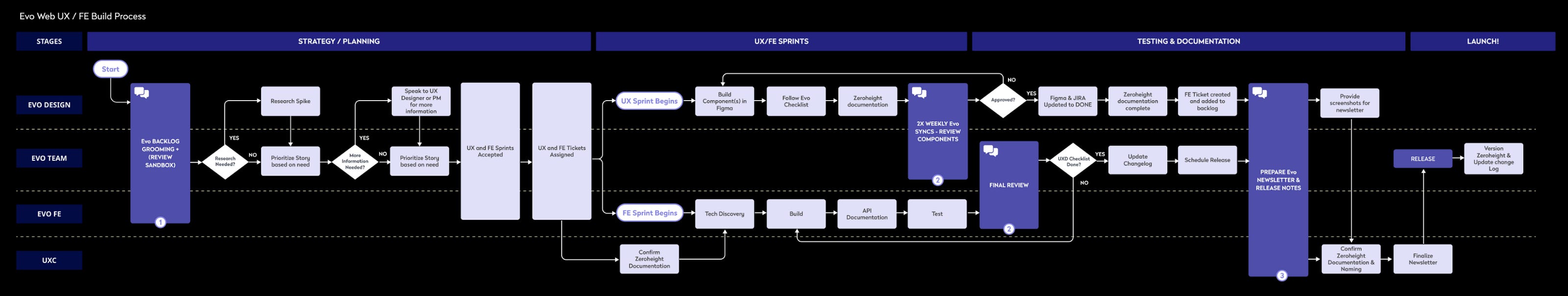
Overview of our UX process for the design system was a collaborative creation by the Evo team under the guidance of Heather White, UX Manager.
Impact
- Complex components: Designed and implemented data tables, charts, and calendars, expanding system robustness and applicability.
- Cross-functional leadership: Led designers, engineers, and PMs to scale Evo for web and deliver consistent experiences across the enterprise suite.
- Mobile system kickoff: Initiated a mobile component library using a federated governance model to address funding limits and encourage co-development.
- Scalability & engagement: Improved processes and grew internal adoption through webinars, workshops, and dedicated communication channels.
- Legacy integration: Standardized UI elements to align older products with Evo while preserving functional integrity.
Results
- Stronger collaboration: Centralized governance for web and a federated model for mobile increased velocity and predictability.
- Consistent, efficient delivery: Adoption of Evo rose across teams, improving platform-level cohesion and reducing rework.
- Future-ready: Clear documentation, guidelines, and training empowered teams to self-serve and reduced reliance on the core system team.
For a contrasting look at how this same systems-first mindset applies in a fast-moving startup context, see how we built a scalable design system for an AI-powered CPG platform at startup speed.
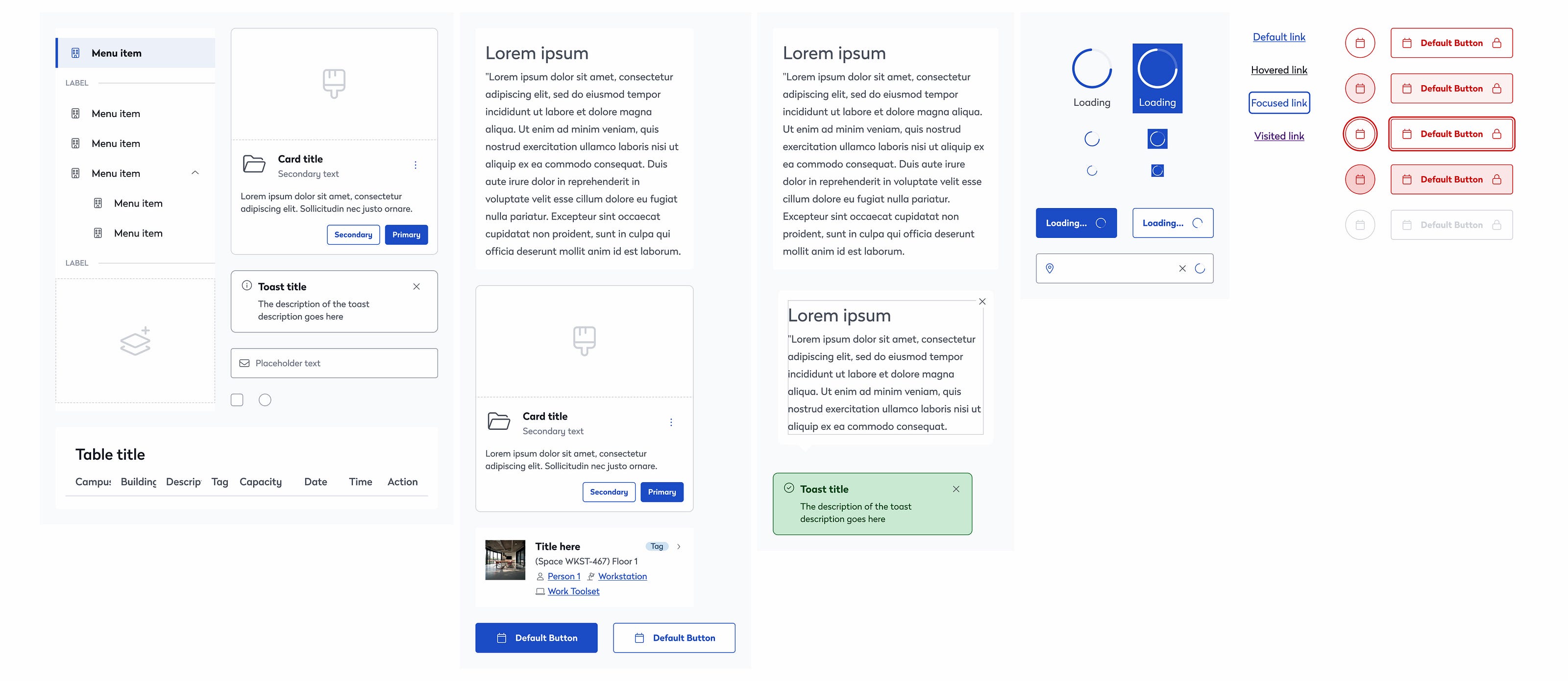
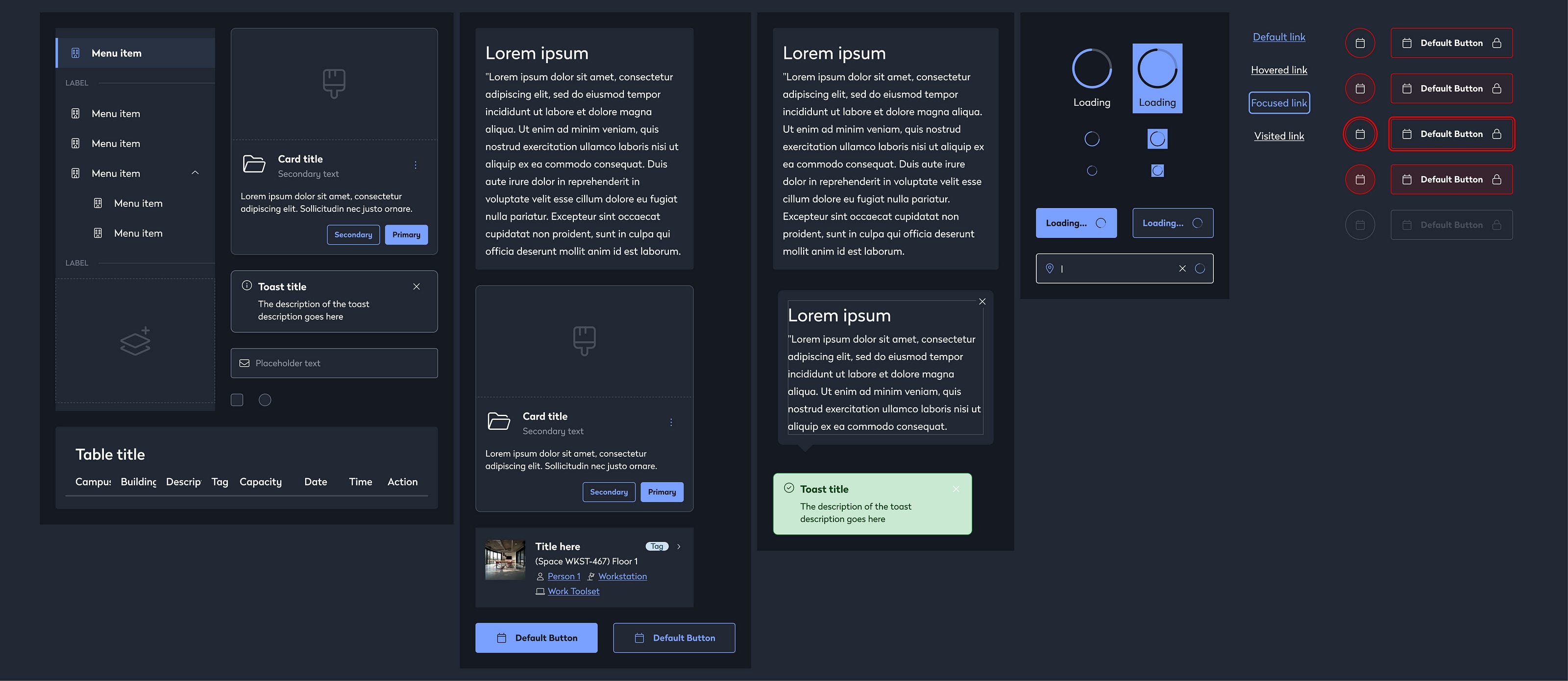
Theme examples (selected, not exhaustive):
- Light theme, web components
- Light theme, mobile components
- Dark theme, mobile components (multiple variations)
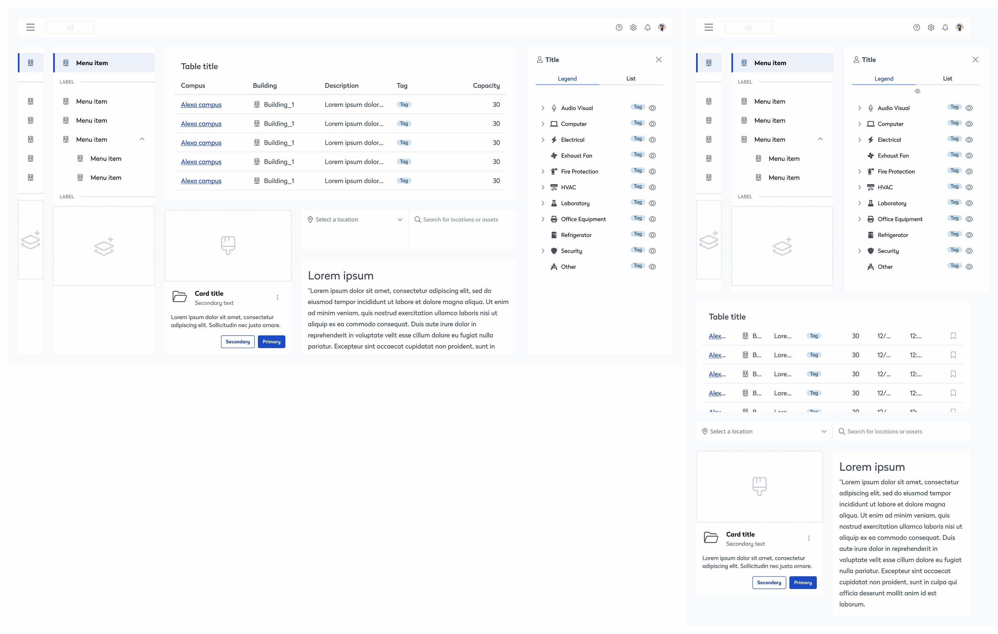
Screenshot of various Eptura EVO design system components in light theme
Screenshot of various Eptura EVO design system components in light theme
Screenshot of various Eptura EVO design system components in light theme
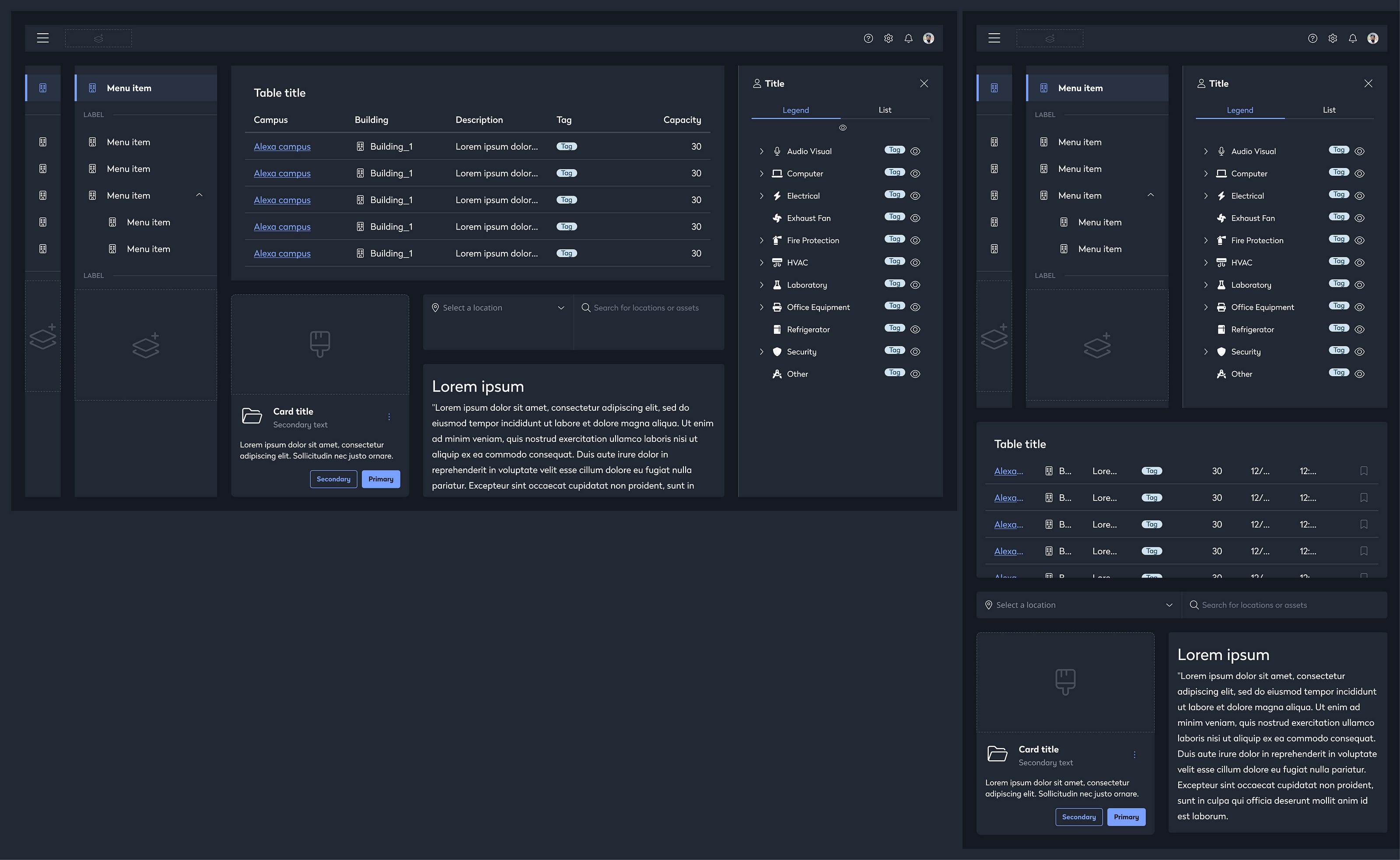
Screenshot of various Eptura EVO design system components in dark theme
Screenshot of various Eptura EVO design system components in dark theme
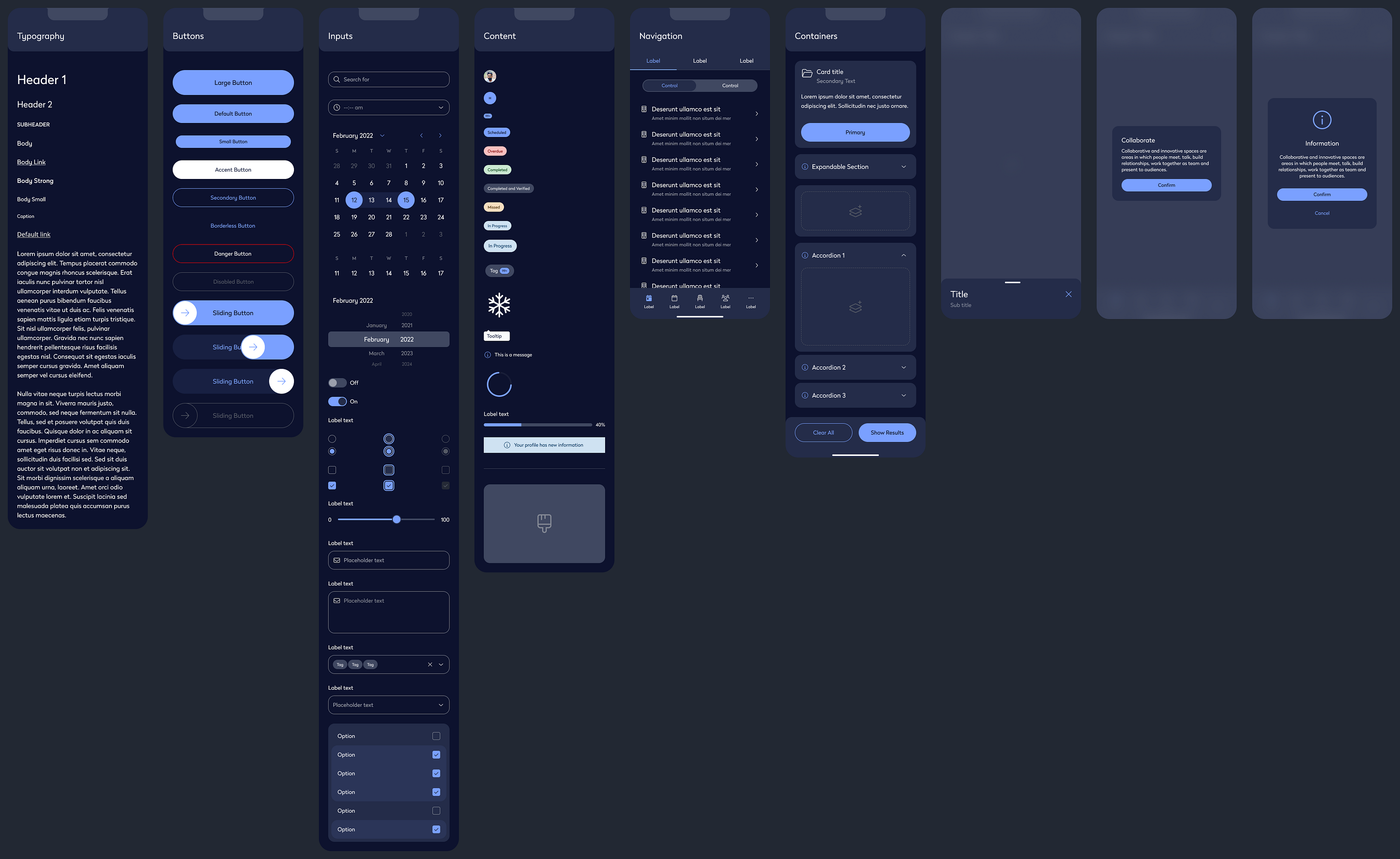
Screenshot of various Eptura EVO design system components in dark theme
Recognition
Our design-system work streamlined delivery across Eptura and supported scale to 16.3M+ users worldwide. The initiative was nominated for the Zeroheight Design System Award for Best Governance, recognizing the value of our governance approach and its impact on Eptura's product ecosystem.
— Zeroheight Design System Awards
Interested in design system work? Let's talk about fractional design leadership for your team.