How SeaLab utilized data-driven design to evolve TopDecked's Magic: The Gathering (MTG) collectible card game (CCG) platform.
Build, Test, Collect, Trade, Explore, Play
— TopDecked
The #1 app for Magic: The Gathering. Stay on top of prices, get ideas for decks, test new strategies, and beat the meta. TopDecked offers more features than dozens of other apps combined
Project Overview
Magic: The Gathering (MTG) is a collectable card game (CCG) created by Richard Garfield and Wizards of the Coast (purchased by Hasbro, Inc in September 1999) as the world's first trading card game. MTG today has around 27,000 unique cards and about 50 million players.
Lincoln and TopDecked's goal was simple: to create the most intuitive and capable tool for this audience by working with SeaLab to improve its all-inclusive online platform to more intuitively allow users to manage decks, play MTG with friends, purchase and sell cards, and more in a fully responsive application.
With MTG competing in a crowded market, SeaLab was challenged to enhance TopDecked's brand, ensuring it worked seamlessly across both digital and physical spaces. We were also tasked with creating new, and updating existing, information architecture and user flows to make the application more intuitive and fully scalable, from desktop to mobile. Our goal was to establish clear patterns that would allow TopDecked to grow and expand in the future.
"Magic is a collectible trading card game (CCG) of fun-filled, strategic games to play with friends old and new. Welcoming worldbuilders, narrative lovers, and gameplay enthusiasts alike, Magic has something for everyone and countless ways to play."
Problem #1: Create a unique brand positioning for TopDecked among competing mobile and desktop applications.
Problem #2: Develop a future-proof, intuitive and cohesive design for new and existing features that provide a seamless experience across mobile and desktop platforms.
![]()
To comply with our confidentiality agreement we have omitted and appropriated confidential information. These designs are a reinterpretation of the original.
Project Challenges
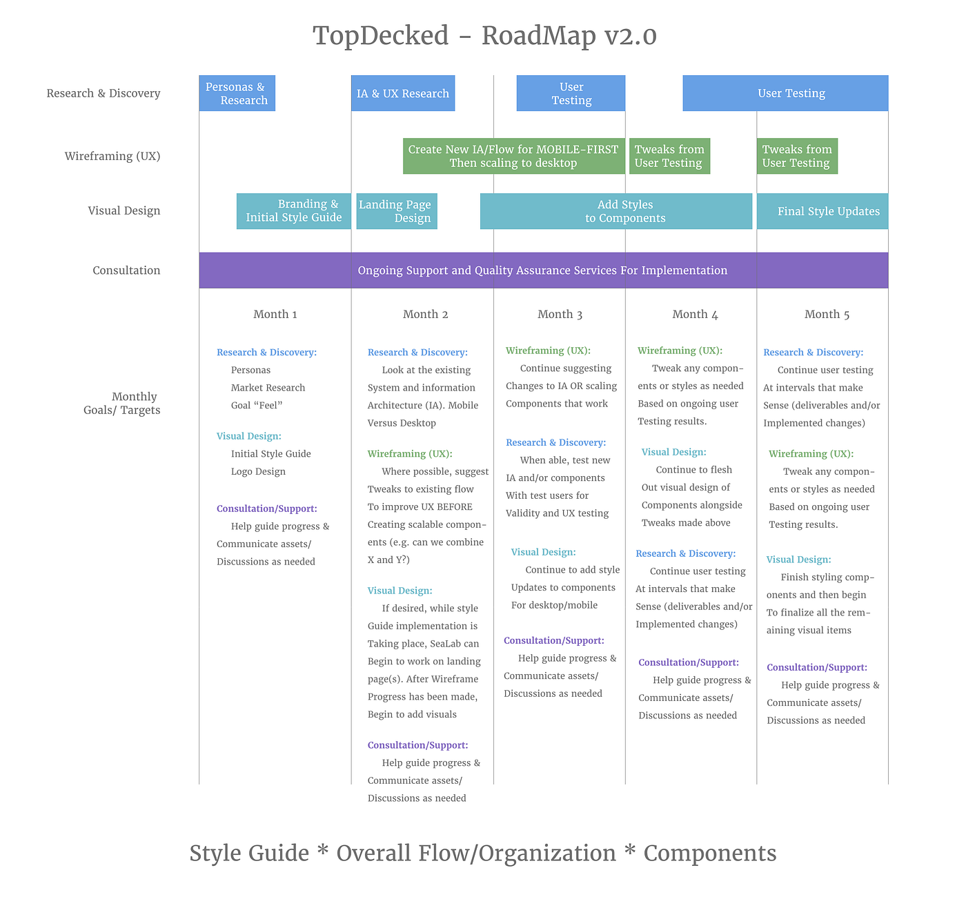
After chatting with Lincoln in detail about his existing TopDecked platform, brand, time constraints and challenges identified by the community, we decided on a few high priority objectives to tackle together over a 5 month timeline.
- Familiarize ourselves with the MTG gameplay and ecosystem along with TopDecked's top competitors/brands.
- Redefining user experience: creating a unified and scalable brand for MTG enthusiasts, from concept to execution, that enhances trust and engagement.
- Incorporating community feedback into the design process while maintaining the project's timeline.
SeaLab's Solution
Deep dive into the world of MTG
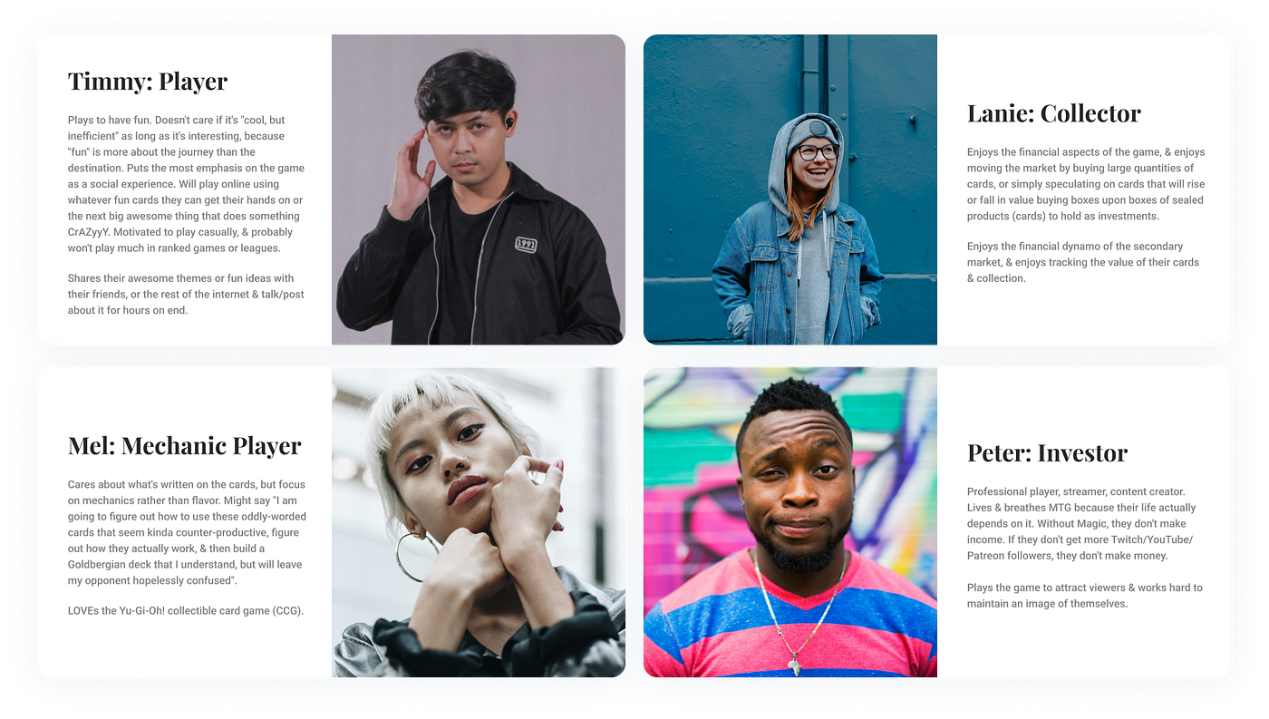
To get started on the right foot, it was imperative to understand our target audience and their needs. First step was taking the time to understand the intricacies of the card game in detail (probably one of our favorite research tasks to date!). This involved not only understanding game play at a high level, but also learning about all the different card variations and where to find that information on each card (such as spells, the variation of card "types" such as creatures vs artifacts, and much more). We then spent some time learning about the online offerings competitors offered and why many players sought out online solutions for deck management.
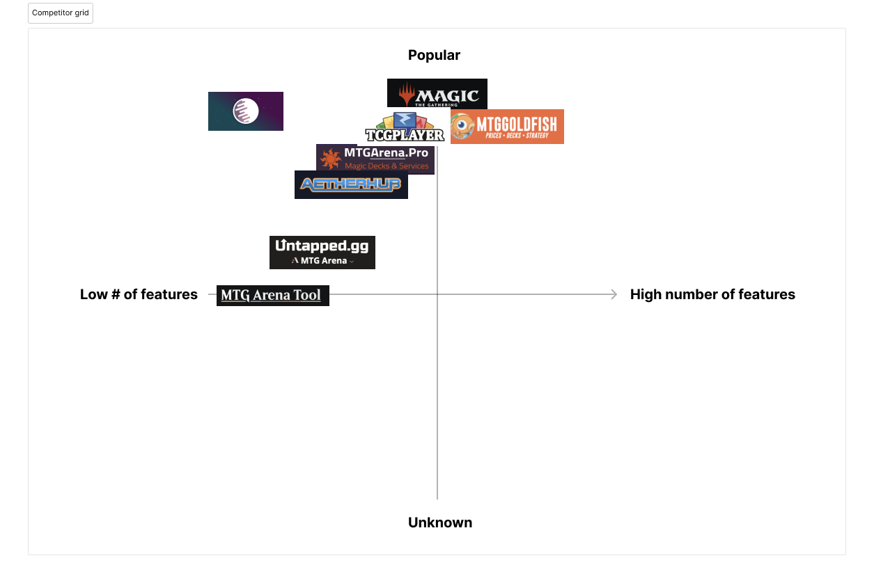
Next, to determine how to have TopDecked stand out in a saturated space, SeaLab spent time researching top competitors. As a part of this research, SeaLab created a competitor map to best identify TopDecked's unique position in the market.
It became clear that "dark mode" was a common look and feel for most platforms (and matches the card game's aesthetic), so we aimed to lean into that style while still standing out with a unique look and feel.
Cross-platform design excellence
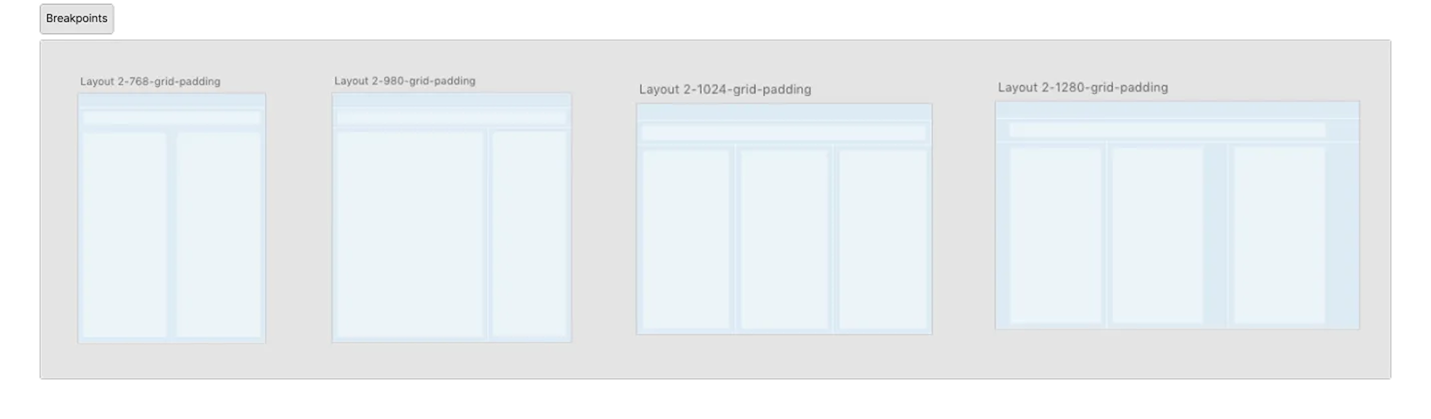
The SeaLab team then turned our focus on solving the challenge of creating an intuitive interface with patterns that scaled seamlessly from mobile to desktop. Our goal was to establish intuitive, consistent patterns that could be used as TopDecked grows while maintaining visual consistency and usability across all devices. This would ensure players could easily navigate and enjoy the platform at home or on the go with their device of choice, and also provide direction to Lincoln and his developers for implementing additional features in the future without requiring a design team to help expand.
Crafting a distinct brand identity
Once our architecture and flows were established and approved, we moved on to one of our favorite steps in the process — bringing our wireframes to life by exploring color and imagery.
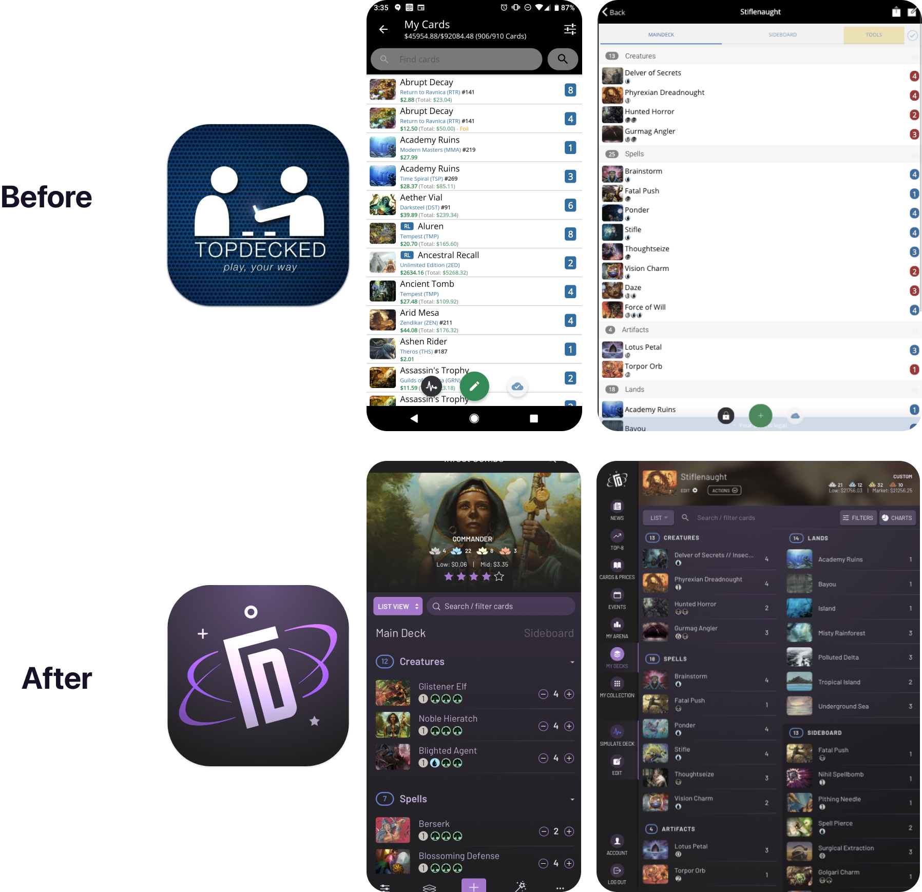
We first worked to create logo iterations in black and white that scaled well down to app icons. Per the application's name and Lincoln's request, we explored imagery that depicted card games, two people playing together, magic elements, and more. We found pretty quickly that "T" and "D" could be combined to fit well in a rectangle card design and ended up leaning in that direction once we received positive feedback from the community.
![]()
While iterating on logos and waiting on community feedback, we performed an assessment of the TopDecked application and identified the number of colors currently used (including colors that could not be changed such as mana colors), inconsistent elements that could benefit from unification, and other elements currently in use to be redesigned in the new design system. We used these as a jumping off point not only in creating our design system deliverable, but also in finding color options that worked well together without losing any of TopDecked's functionality.
For a look at how we built a design system from scratch for a fast-moving startup in a similarly short timeline, see our design system build for the Goods CPG platform.
Engaging and accessible experience
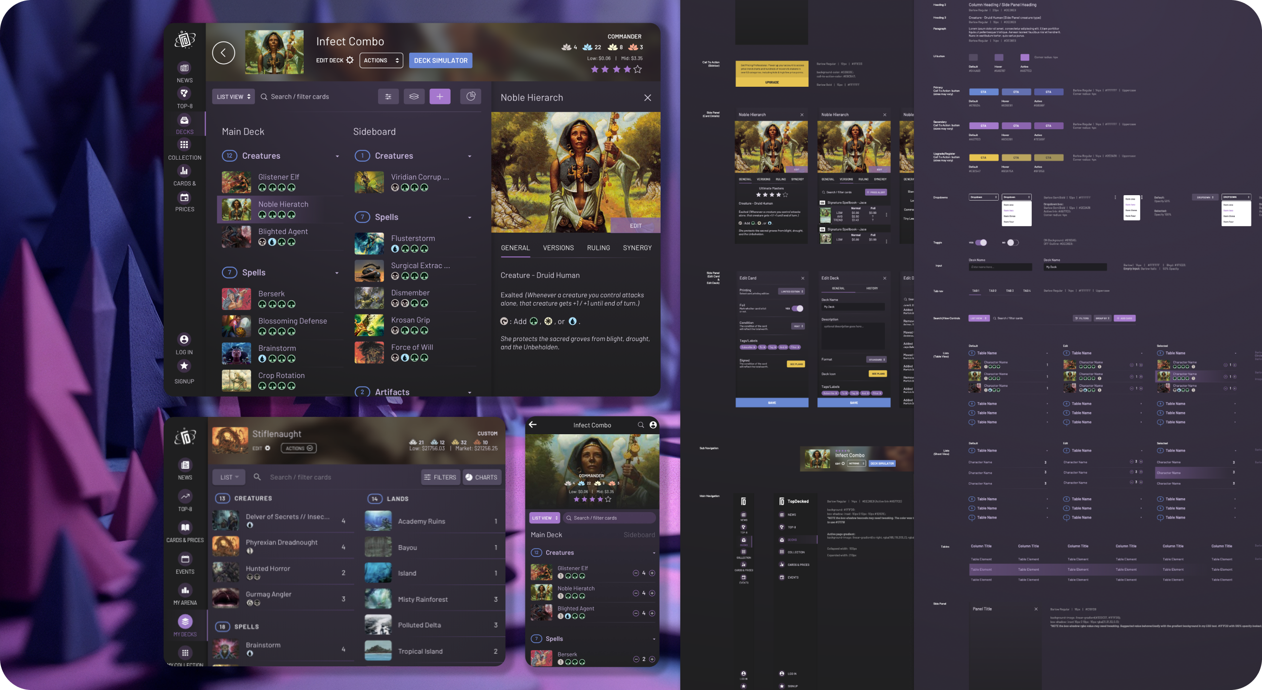
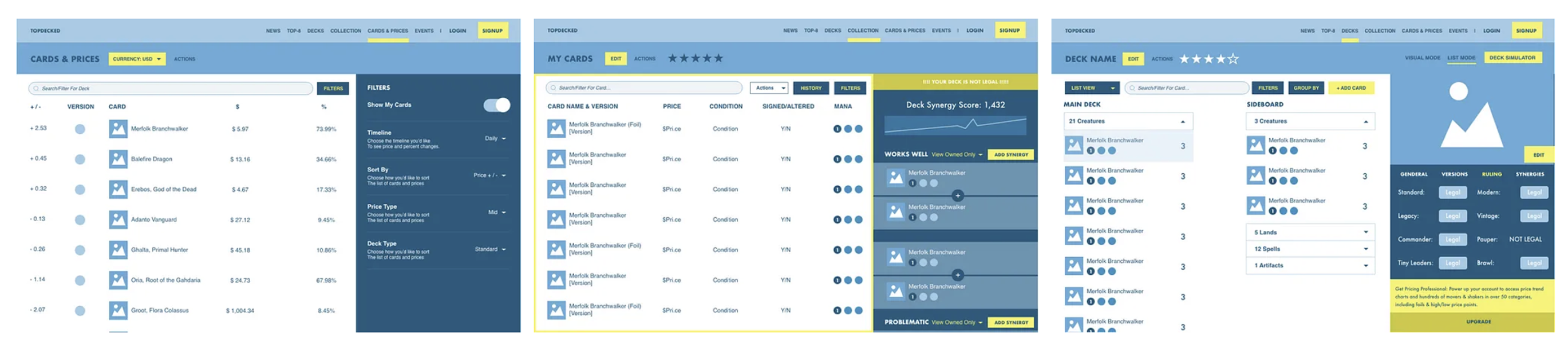
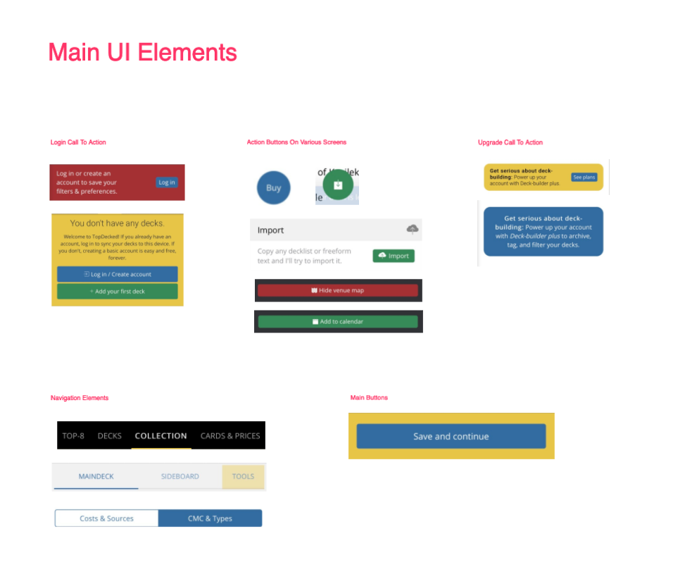
With our brand established, we moved to high-fidelity creation and brought our wireframes to life with accurate product data and card information. We prioritized creating an inclusive and accessible interface with features, and an experience that caters to both new and expert players.
Throughout the design process, SeaLab utilized Lincoln's connection to his community to gather ongoing feedback, and iterate on the go.
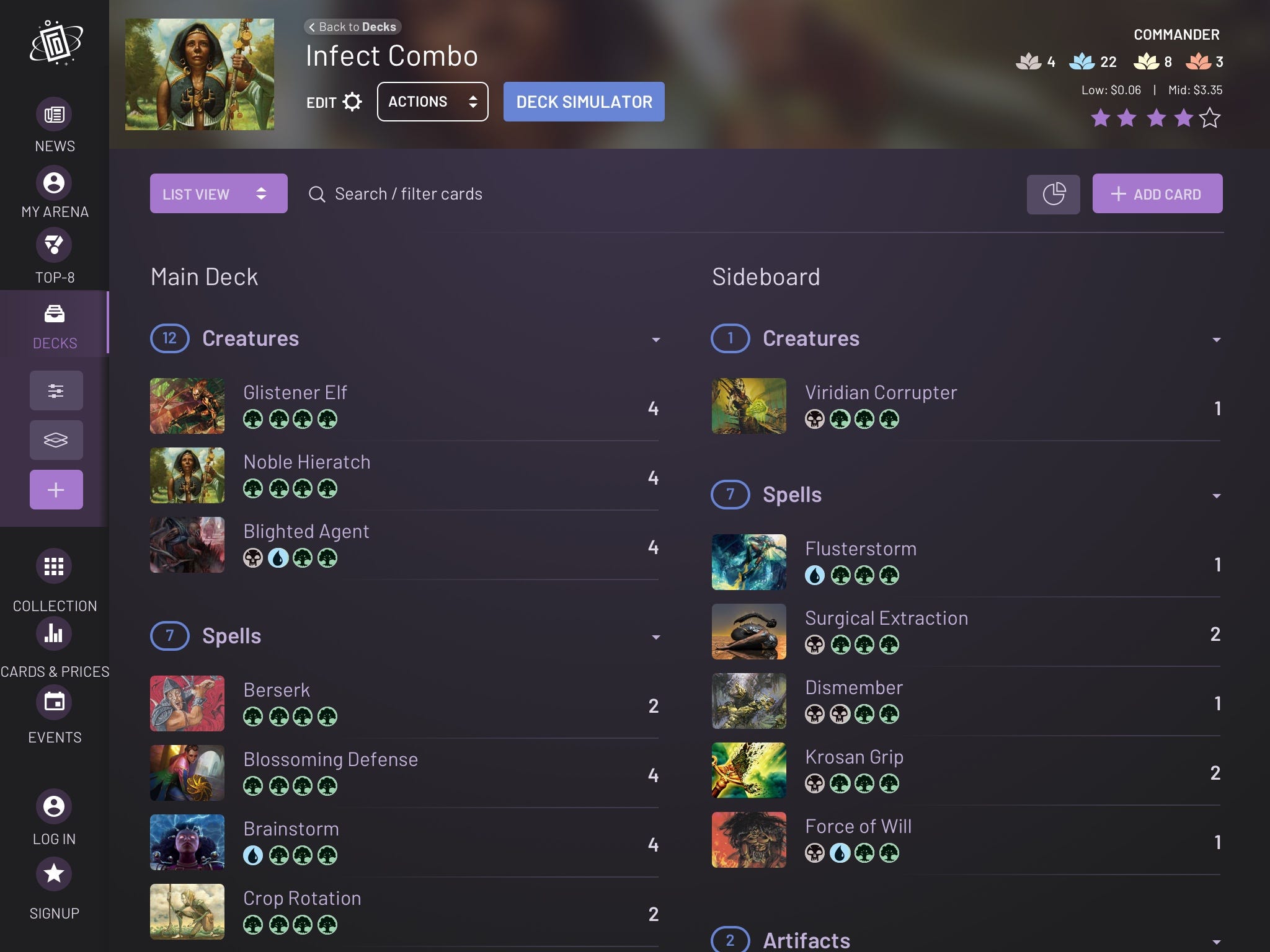
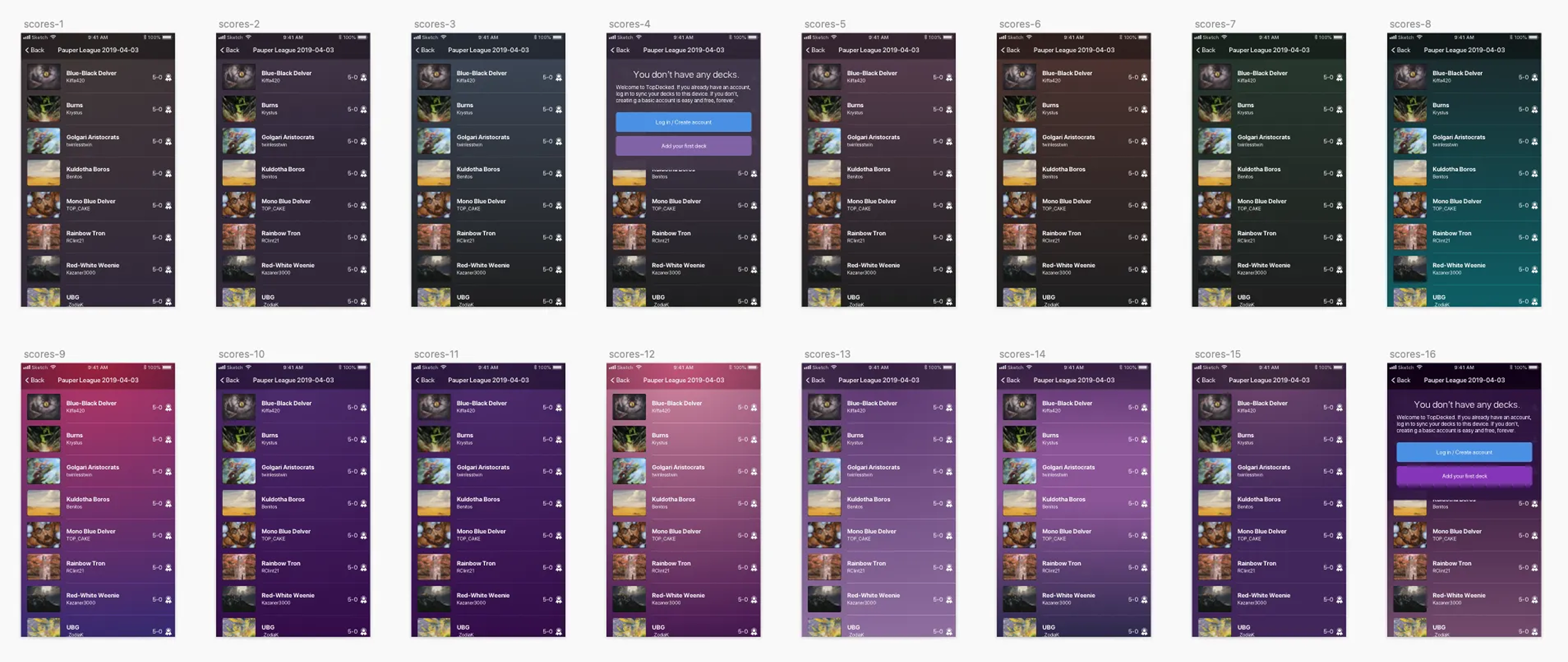
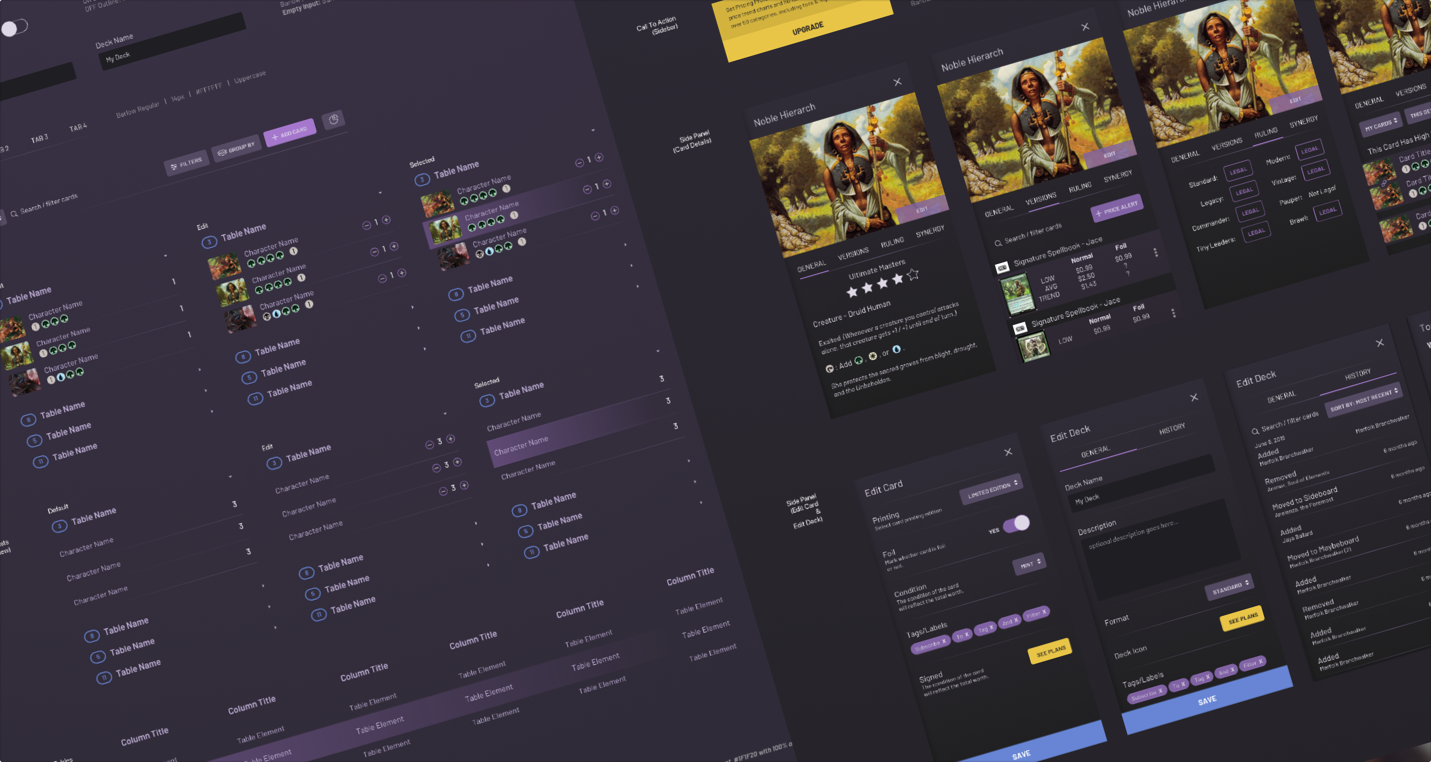
Sample design deliverables for desktop

Sample design deliverables for tablet

Sample design deliverables for mobile
The MTG community responds
As TopDecked's new look and feel was released, Lincoln kept us up-to-date with the response.
We watched TopDecked's app rating maintain a strong presence on the Google Play Store, with a temporary dip from 4.6 stars to 4.1 after the UI update, a common reaction to change. However, after addressing user concerns, the rating quickly rebounded to an impressive 4.7 stars.
he updated architecture and design led to a 30% increase in both user retention and conversion rates (having stayed there since), showcasing the significant impact of the enhancements.
Conclusion
Today, when you combine both iOS and Android users, TopDecked is approaching 1 million downloads and a 4.7 rating on the Google Play Store.
SeaLab purposefully doesn't have a niche product area we focus on, and it's exactly because of partners like TopDecked, from research to final creation, TopDecked has been, hands down, one of our favorite projects and an absolute joy to work on. For another example of how we've unified cross-platform experiences through consistent design patterns, see our UX overhaul of iOFFICE Hummingbird across mobile and desktop.
We hope y'all enjoy it as much as we did and can't wait to work with Lincoln and the MTG community again.
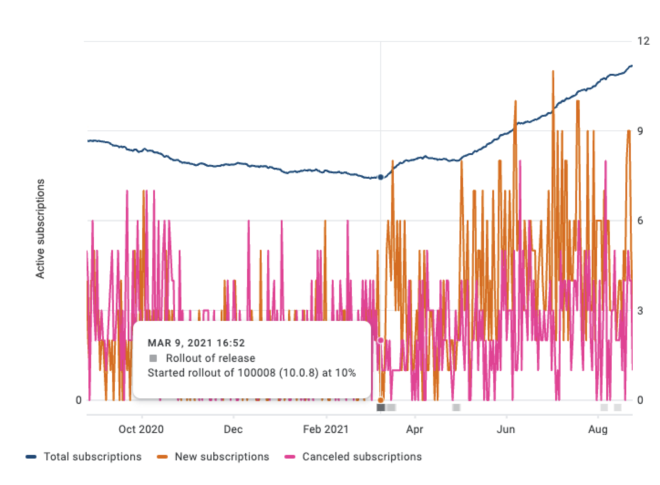
Screenshot of active subscribers increasing after the redesign
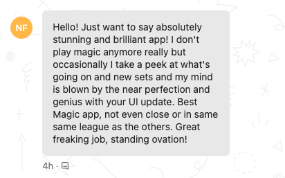
screenshot of a message saying "Hello! Just want to say absolutely stunning and brilliant app
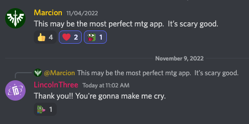
Screenshot of a review saying "This may be the most perfect mtg app. It's scary good"
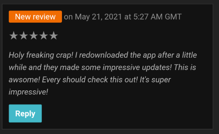
Screenshot of review saying "Holy freaking crap! I redownloaded the app after a little while and they made some impressive updates!
"I would say that this is hands down the BEST MTG companion, but it's really the ONLY MTG companion. The only one you really need anyway. Not only is it just really pleasing to look at, it gives you everything you need to manage your cards, build and explore new decks, track value and price history, and theorycraft/playtest your decks. Plus, the developer is really receptive and encouraging of user feedback, and also even personally helped me use the app when I contacted the help section. When I asked about the possibility of implementing things I had thought of, I learned they were already in the works so this thing is constantly improving. Worth it, worth it."
— Brian Hamilton, TopDecked User