How SeaLab helped iOFFICE dissect, simplify, and unify their application across multiple platforms while increasing usability.
Main Problem Overview
iOFFICE, a facilities management software company based in Houston, TX approached SeaLab with a challenge in 2017: unify and improve the user experience of existing OpenSpace applications, already developed and in use both in desktop and mobile form.
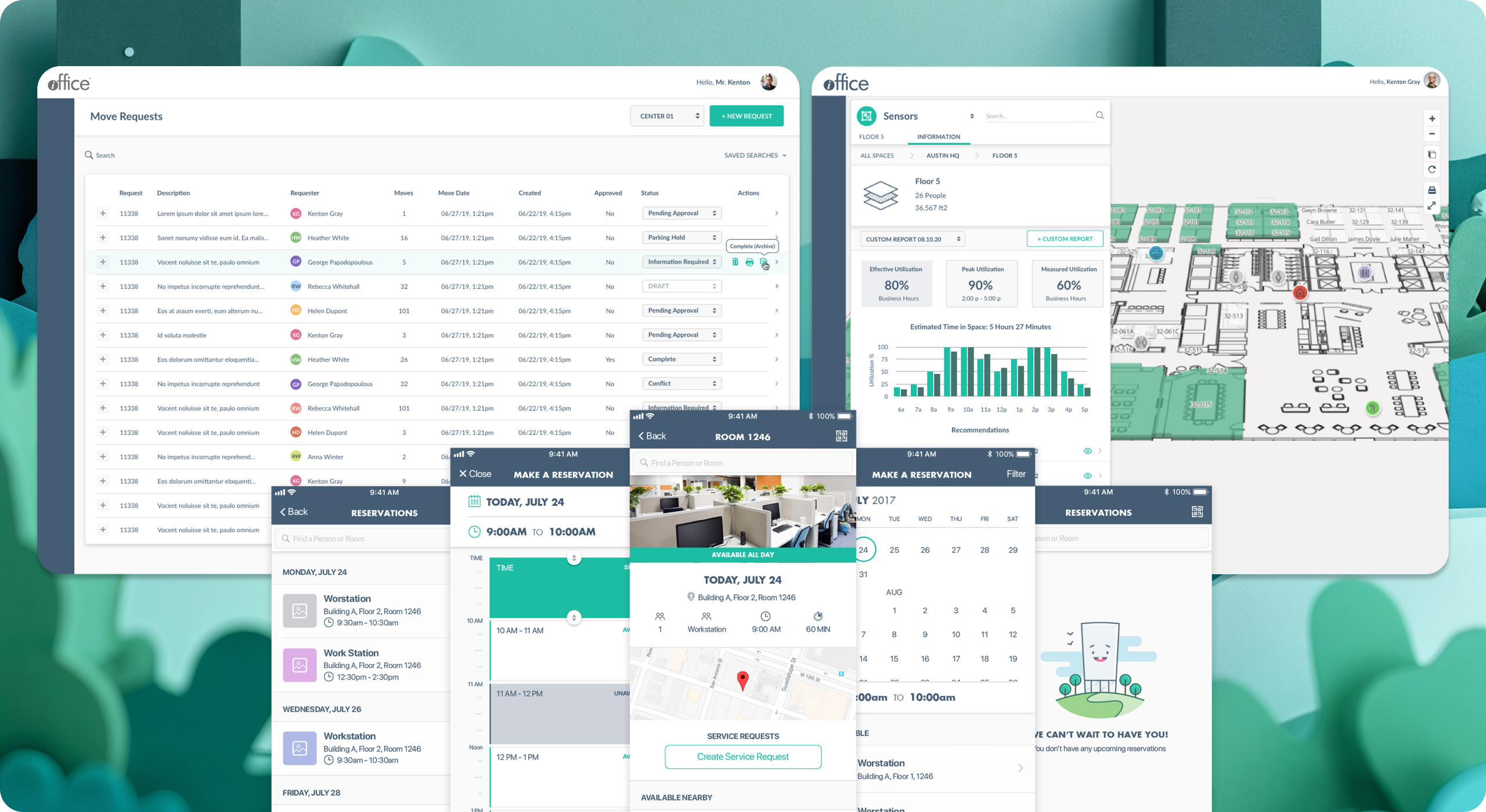
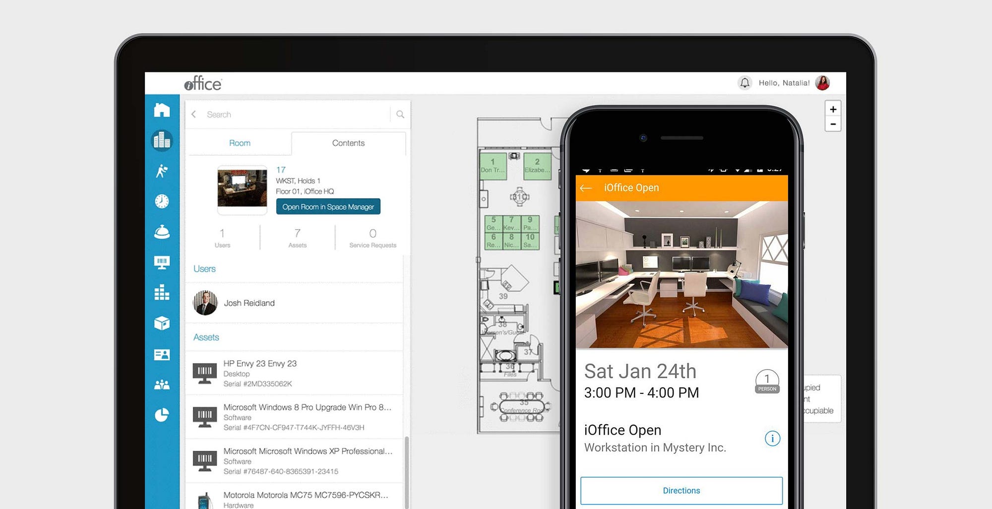
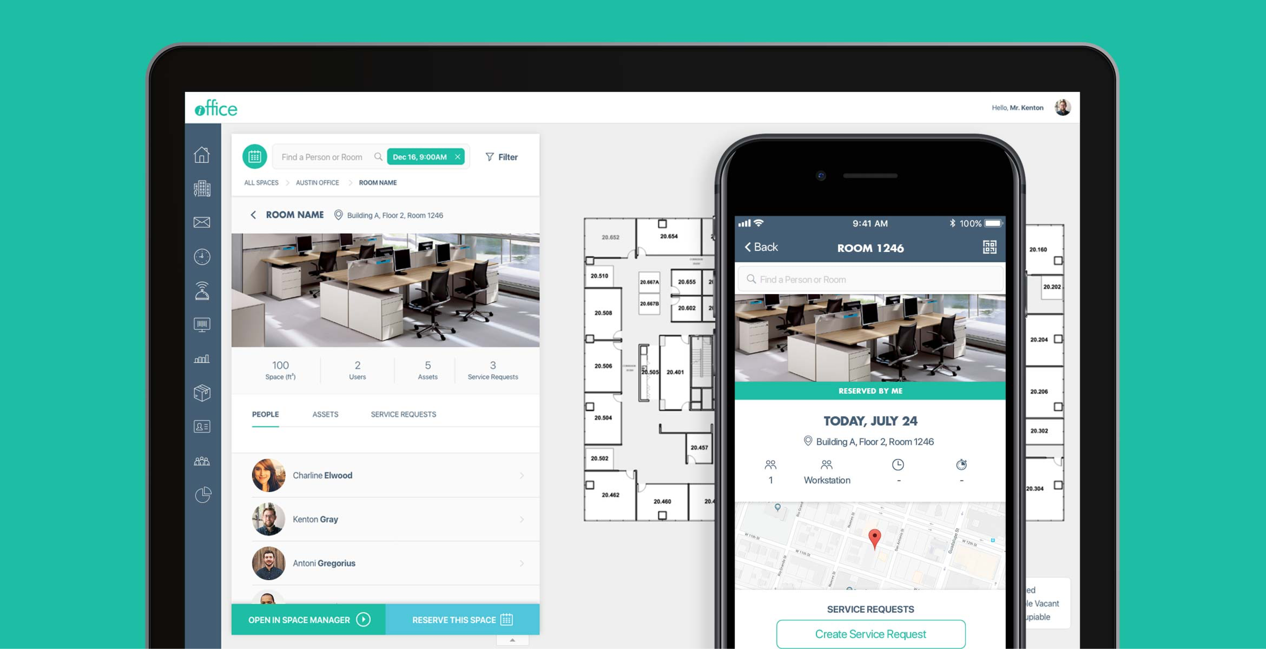
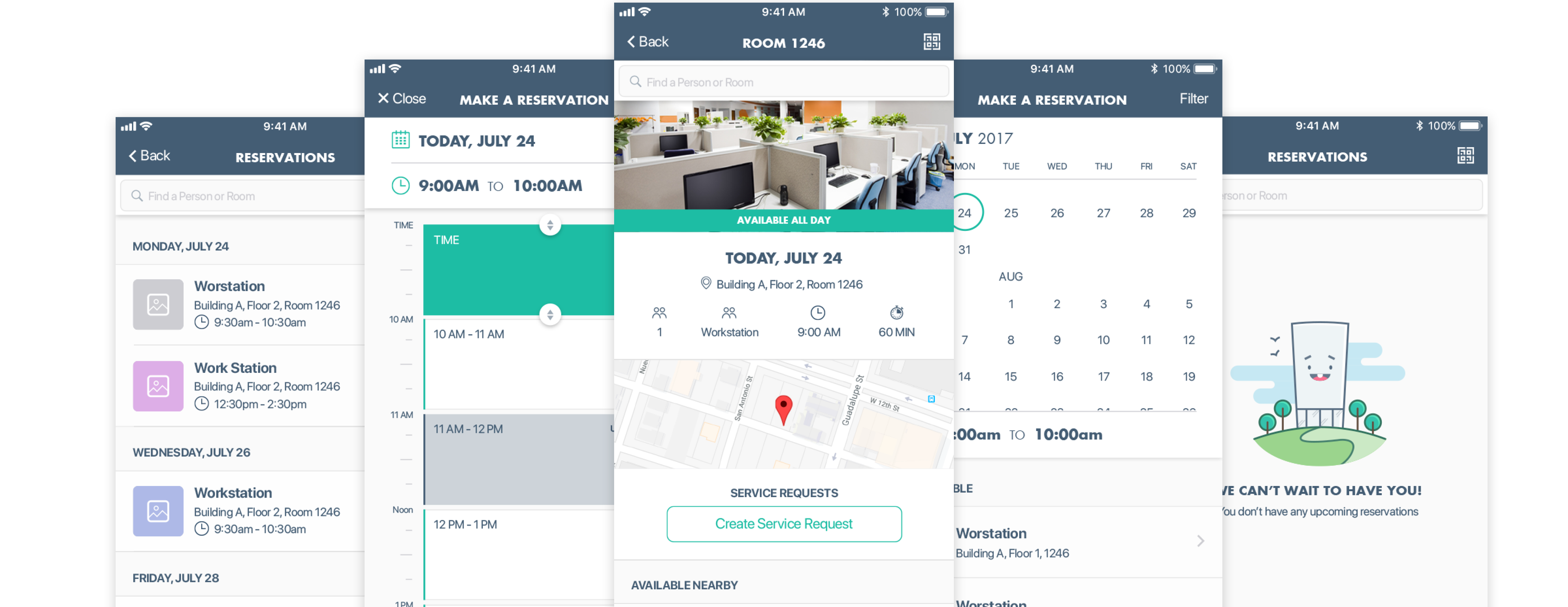
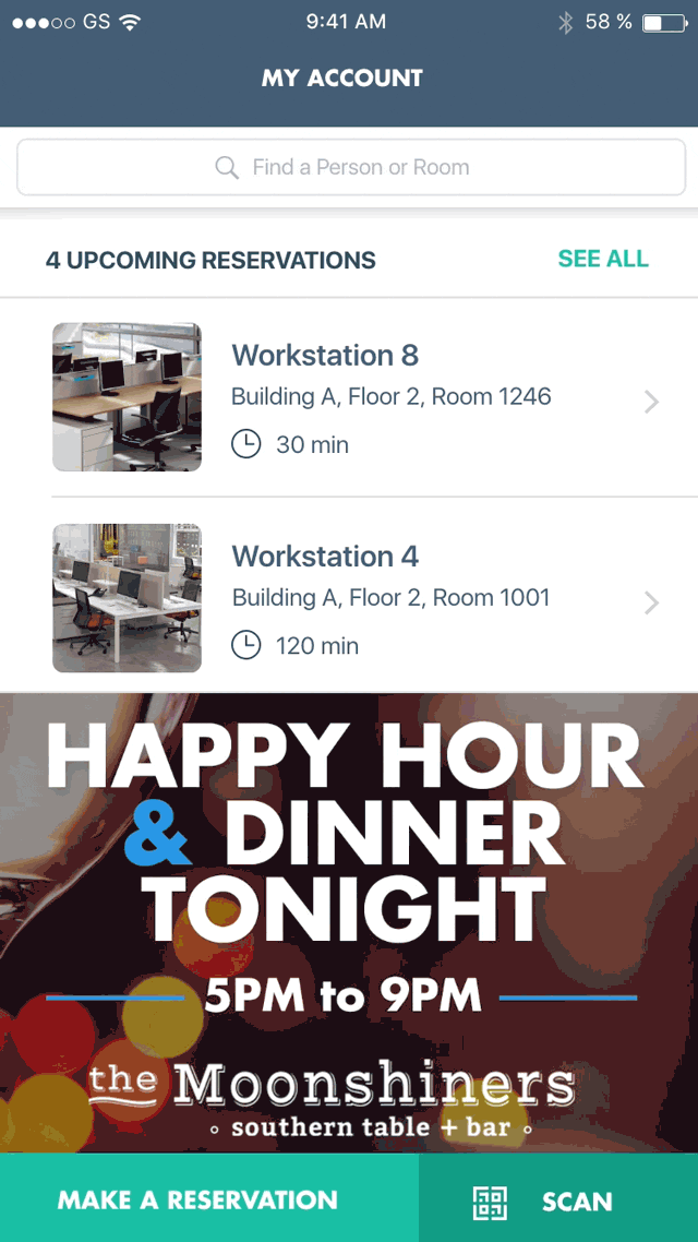
After the completion of the project, OpenSpace has since been rebranded as "Hummingbird" and now serves as the suite's customer-facing tool to help employees find people, places, and information, and also to see and reserve available work spaces, create and edit service requests, view the status of mail items, and more.
A company that cares about their customers, iOFFICE first conducted user research of their own, and discovered that there was an opportunity to improve familiarity between platforms, reduce the number of steps to accomplish goals in each, and optimize the user interfaces to be intuitive for their white-label clients of all shapes and sizes across the globe.
Problem #1: How to unify the user interface of an existing product across multiple devices in an intuitive and user-friendly way?
Problem #2: How to add additional features to the experience while simultaneously reducing the barrier to entry for daily users?
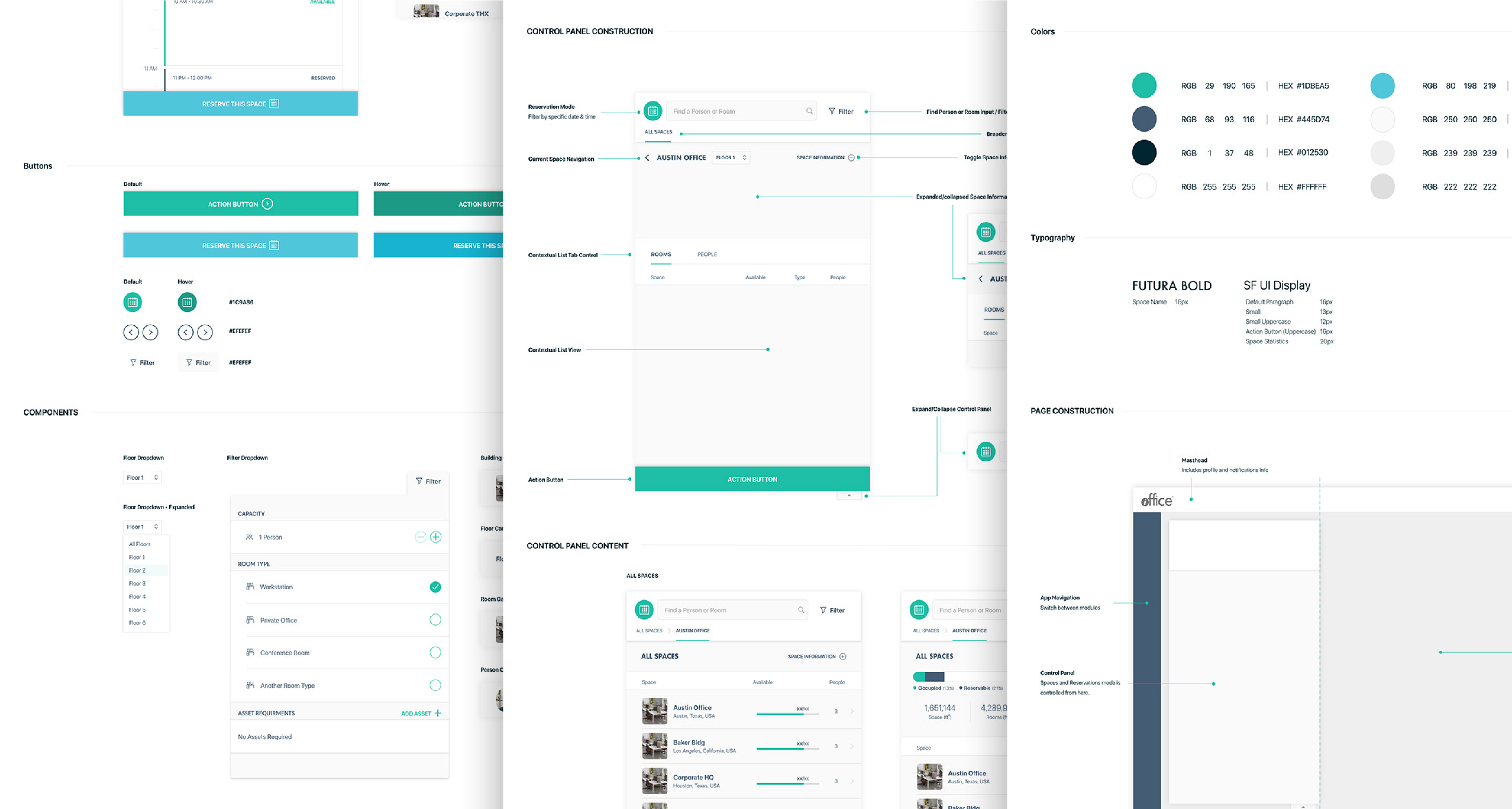
To comply with our confidentiality agreement we have omitted and appropriated confidential information. These designs are a reinterpretation of the original.
SeaLab's Plan
After internal discussions with the SeaLab team, iOFFICE, and Hummingbird users, we identified a few objectives to make our sprints successful:
- Create an experience on both mobile and desktop that is consistent with modern web usage standards.
- Identify and unify repeating elements on both platforms, reducing the amount of code and design patterns wherever possible to eliminate confusion and inconsistency.
- Refrain from using color alone to distinguish between elements, as branding is expected to change dramatically between customers due to the white label nature of the product.
- Keep in mind the original core design patterns and navigation, and look for ways to integrate additional functionality, making sure to update navigation and elements to be appropriate for each screen size.
- Enhance speed and efficiency by directing users to what they are looking for quickly and clearly, specifically limiting the number of steps to achieve an action wherever possible (as some users access this application several times a day).
What Works and What Doesn't?
It became clear iOFFICE's users were generally pleased with the interface. Our initial research into what existing customers liked and didn't like revealed a desire for optimization and the inclusion of a few additional features rather than a need to completely strip and redo the UI from the ground up. Most helpfully, they identified an opportunity to explore the treatment and positioning of certain navigation elements and calls to action, helping SeaLab choose our approach: to assess the general flow and navigation of the application before all else. Our next core goal was to unify the design system while also maintaining consistent and useful patterns users were already accustomed to and were used to looking for. This meant we had to be mindful of the existing system and tweak from there.
Our first step was to identify the core navigation and flow patterns of the existing Hummingbird application and where there were opportunities for exploration. We did this by meticulously going through each possible flow in the application (mobile first, then desktop later) and noting the main calls to actions and their locations on each screen.
Once these patterns were identified, we thoroughly researched the landscape of similar applications to note and identify design and navigation patterns that users with like-minded goals and objectives are comfortable using. We gathered data from their top five desktop and mobile competitors and pulled our findings together into a comprehensive document we could then assess at a high level.
Once all our research had been collected, we noted differences in audience, purpose, and general goals of each application to fully understand and dissect the research and present our findings internally and decide on a plan to move forward.
Low-Fidelity Wireframe Creation (Progressive Enhancement/Mobile-First)
Once our main goals were identified, we dove into the layout of the pages themselves beginning with the mobile application. The largest challenge we discussed with the iOFFICE team was deciding whether we wanted to make "search for coworkers" as an equally prioritized call-to-action item as "book a room". (This was a unique challenge due to the fact that it extended beyond design into business requirements and stakeholder priorities). We played with several iterations of the initial UI and tested it internally, with iOFFICE stakeholders and with our end users to find the best middle ground solution that accomplished everyone's goals.
After several initial low-fidelity explorations, our team, iOFFICE, and our Hummingbird users all found a solution that worked for everyone and we were able to continue forward finalizing the details of each screen and identifying the general design patterns throughout.
High-Resolution Visual Design Creation
Knowing our end users would install their own third-party branding on top of the final application, we played with a few very neutral color palettes. As our initial direction was to find a color palette that reflected the Hummingbird application's tone of "corporate" and "serious", we first explored a lighter theme with dark elements taking a front seat. This not only gave the application a very professional look but also helped communicate with color due to the high contrast.
However as we continued to bring the application to life, it became clear the darker elements competed with our call to action color and created an obvious distraction on certain screens, prompting us to explore removing more of the dark colors from the interface. The result was the application immediately felt less constrained, and the Hummingbird call-to-action color successfully became the loudest element in the application. After testing both options with end users and stakeholders, we had found our look and feel.
The Final Result
- Optimized & improved the user experience based on customer and stakeholder feedback.
The entire redesign was based around user and stakeholder goals, and feedback that we heard directly from iOFFICE and their customers. This end result was approved on the basis of the solid information and research we gathered at the beginning of the project on what works, what doesn't, and where we want to go from here. We consistently shared results and thoughts with our stakeholders and end-users in order to gain feedback and direction throughout the process.
-
Established familiarity between platforms through the creation of a cohesive design system.
As iOFFICE had previously built the original OpenSpace (rebranded as Hummingbird) applications on two separate code bases, there existed a disconnect in designs between the desktop application and the mobile application. One of the biggest differences between the mobile and desktop is the inclusion of a "dashboard" page on mobile that does not exist on desktop. The desktop application, in contrast, has a very complex map integrated that was not yet included on mobile. We had a fun time dissecting the user interface of each to identify patterns, strengths, weaknesses, and opportunities for unification between platforms. -
Created an intuitive and neutral interface that is easy to understand and navigate.
By exploring and testing icons, typography, and spacing with end users with a focus on being minimal and clean, our final application design transformed into a very streamlined and light interface with optimal space for touch or click (depending on platform), no dependency on hover, no dependency on color, and best of all, happy iOFFICE users. -
Reduced the barrier of entry for daily users by reducing the minimum number of steps to accomplish a goal by 66%.
Where the previous mobile application required up to 5 steps to reserve a room, our new design could take as few as 3 taps.
The Hummingbird redesign has received positive feedback since our version 3.0 update. Users have responded well to the app's features and simplistic redesign.
There was a demonstrated 66% improvement rate on reserving rooms, a core feature in making Hummingbird a valuable and reliable organization tool.
"Great tool. Easy to use. I appreciated the quick ability to reserve a space and find people to meet with"
— iOFFICE Hummingbird User
"Simple and Easy"
— iOFFICE Hummingbird User
"Lot's of good stuff in here and getting such great feedback. SeaLab did an amazing job!"
— Kenton Gray, CTO, iOFFICE
We set out to unify and improve the user experience of existing OpenSpace applications to provide a state of the art tool for Hummingbird users that is intuitive, flexible, and functions out of the box for companies who use the product. Through expert research & development, intuitive design implementation, and effective communication throughout the project, we accomplished these goals and are pleased with the feedback and measurable results.
We look forward to helping iOFFICE continue to grow and expand Hummingbird's capabilities over time. iOFFICE later became part of the Eptura ecosystem — see how we scaled that design system to unify 10+ enterprise products for 16.3M+ users.
For another look at how we've built touch-friendly, future-proof design systems for client-facing tablet and dashboard experiences, see the TreeHouse UX case study.