The Many Lives of Cal: How a tiny cephalopod charts SeaLab growth and matures into our signature sidekick.
If you've followed us since the "SeaLab Creative" days, you've seen our mascot Cal change outfits more than a touring band. Arms, no arms. Flat color, then gradients. Birthday cakes, hammocks, seasonal costumes. Cal's look has evolved right alongside our studio.
This isn't a vanity montage. It's a mini case study in how visual systems mature: fewer rough edges, clearer rules, more room to play, while staying unmistakably "us."
Who's Cal, anyway?

Cal is our little cephalopod, the mark you see on our site, decks, and team swag. He's our agency personified: curious, adaptable, and a touch weird (on purpose). His evolution mirrors our own from scrappy try-everything shop to a product-minded team that sweats the details.
Baby Cal (& SeaLab in it's infancy)
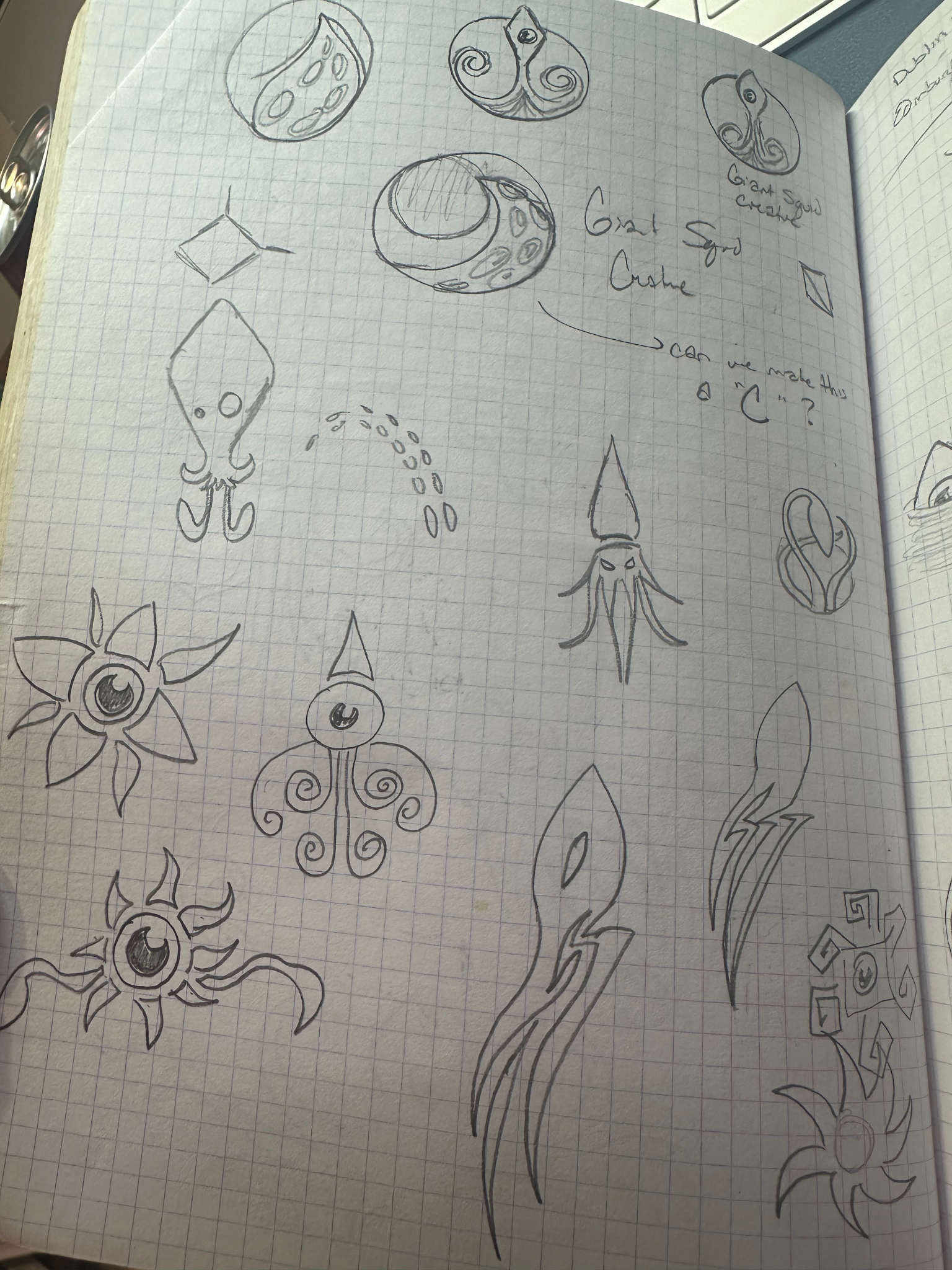
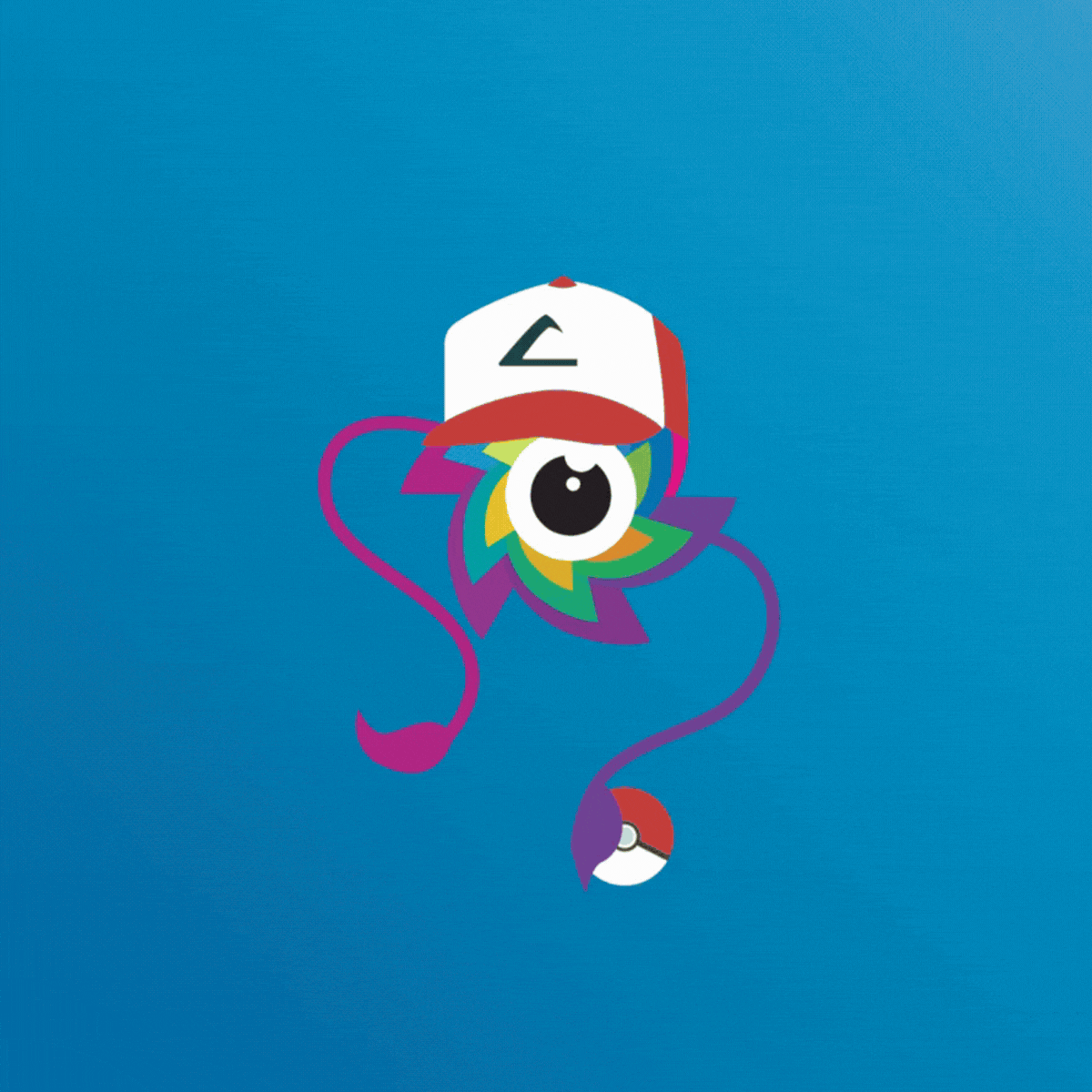
In the Baby Squid era, we did a bit of everything and had a blast doing it. Cal showed up in holiday sets, birthday scenes, tropical hammocks — you name it. Those experiments gave us creative range and a community who came along for the ride. Cal had a flat color, and arms out by default. He came with lots of props and seasonal dress-ups, very mascot-y, playful and always moving. He was messy and fun!
"We were just excited to make things and make them move."
— Heather, CEO of SeaLab
What it taught us: Play invites people in. But logos without rules will happily run your brand into the ocean.
Chapter 2: Cal Glows Up with our Projects
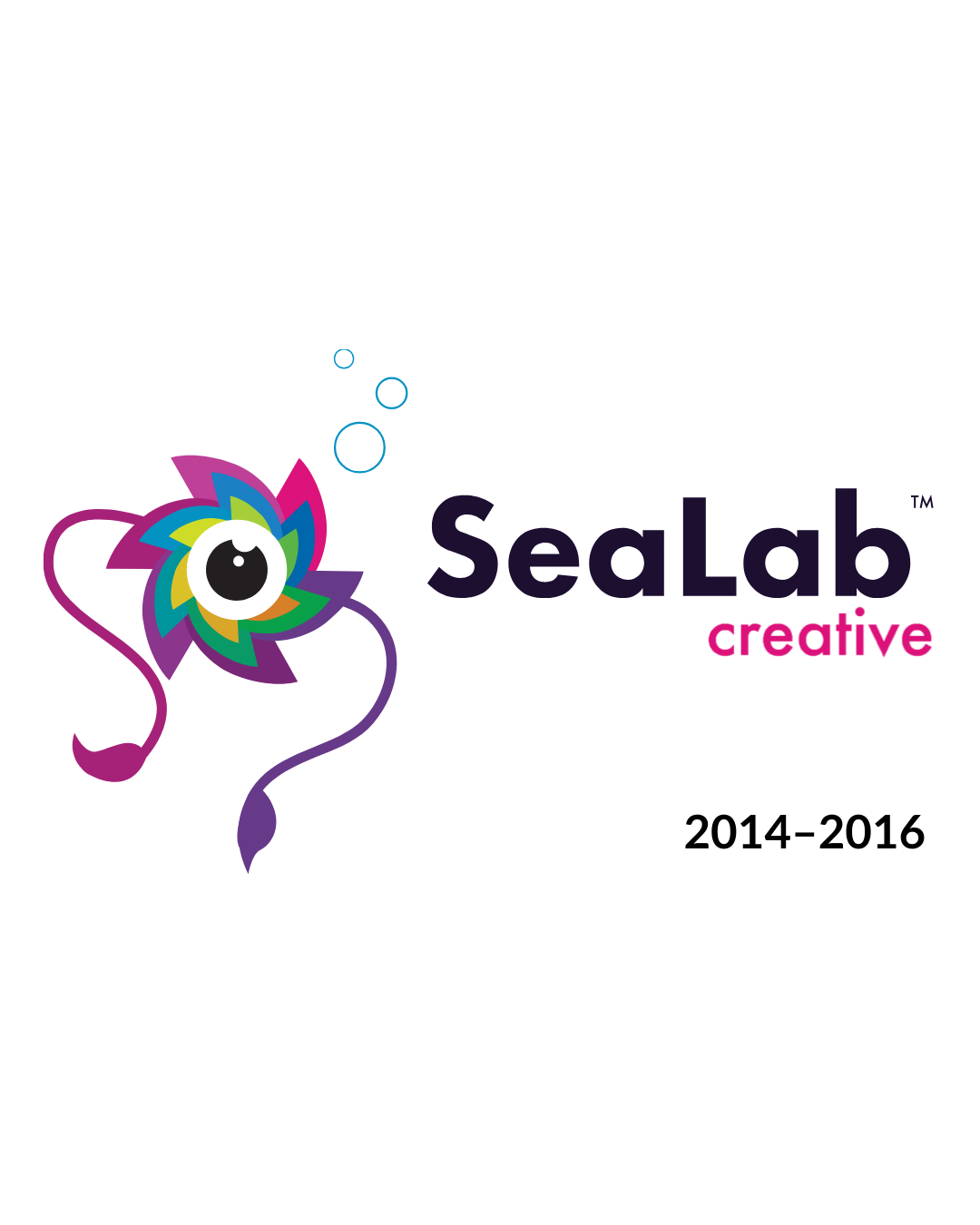
SeaLab LLC logomark in 2014
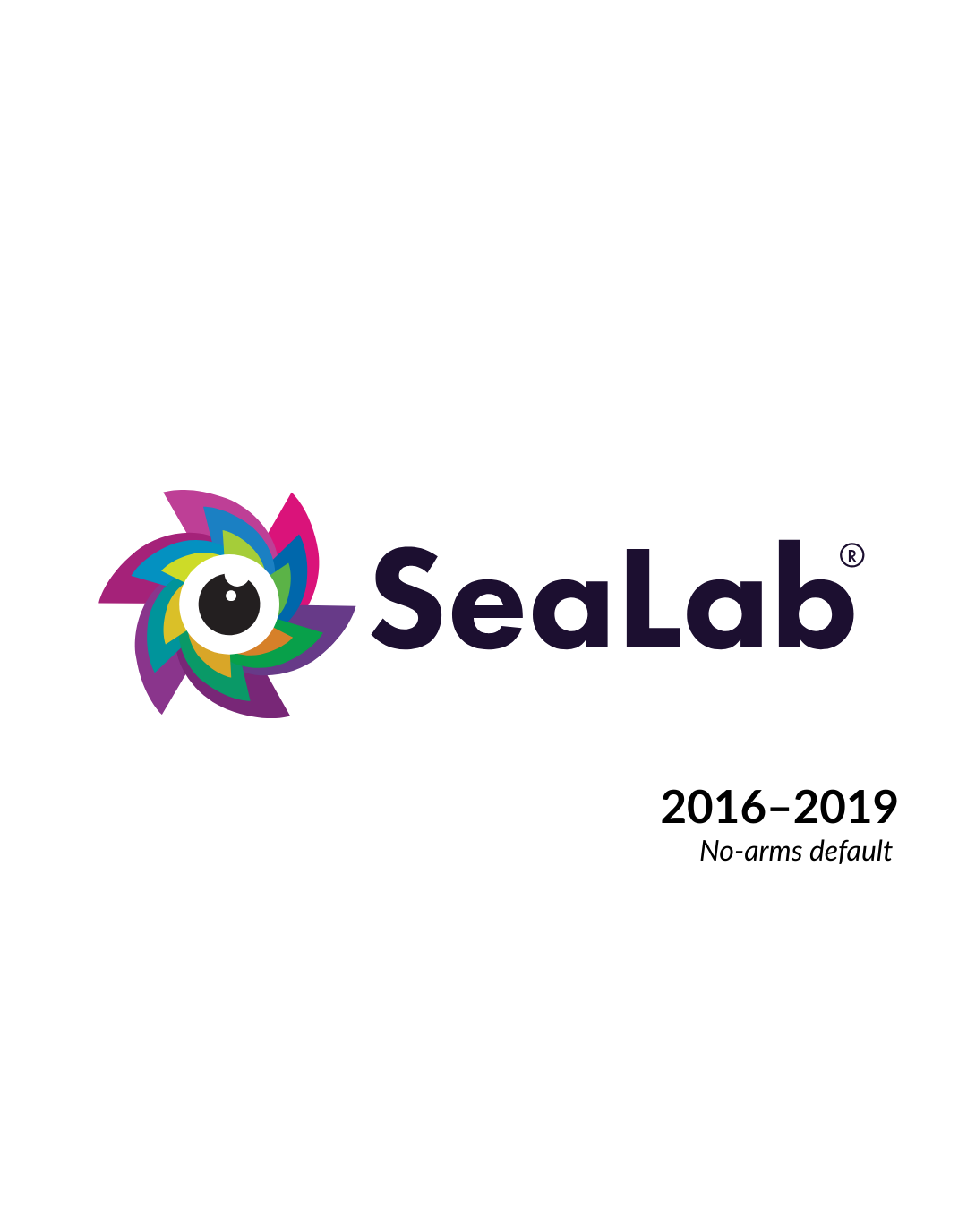
SeaLab LLC logomark in 2016
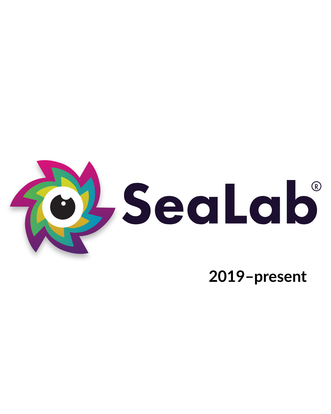
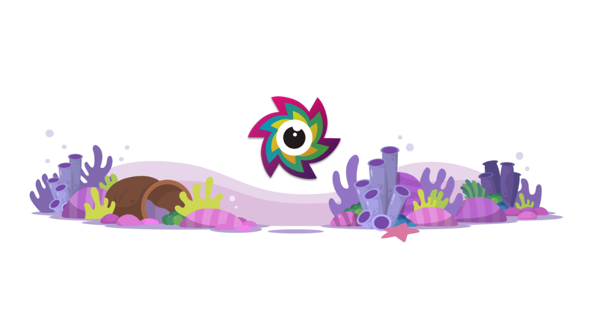
SeaLab LLC logomark as of 2019
As SeaLab secured bigger projects and our mark showed up in tighter spaces (such as favicons, app navs, and product UI) Cal needed to scale down gracefully. Cal shifted to a default new state with a simplified silhouette that held up at 16px without losing personality. As we began to grow and work with enterprise clients, a polished Cal helped reflect a tighter "less silly, still creative and out-the-box thinking" type mindset. This phase matched a shift inside SeaLab, too. We doubled down on the product work we do best: UX, design systems, and tight dev collaboration. Less "everything for everyone," more "here's the craft we stake our name on."
The look: Simpler silhouette. No arms by default. Arms appear only when they help tell a story. (We realized his arms could appear when needed rather than being there all the time.)
What it taught us: Defaults make speed possible. Special moments make the brand feel alive.
Chapter 3: Gradient Cal for Depth & Dimension
In 2019 we made a small shift with big implications. Cal refined his style with gradients and a simplified color palette. Gradients gave Cal dimensionality and polish that plays nicely with contemporary product UI and our color system. We also simplified his color palette down to 6 colors (instead of 18), making swag easier to create (like our stickers!) and also gave him a more cohesive feel rather than 18 individual colors. It's still Cal, just more grown up.
This mirrors where SeaLab is today: systems thinking, higher-fidelity product work, and teams that care about the whole experience, not just the surface.
The look: Modern gradients and subtle depth.
What it taught us: Evolve the language, keep the accent. The goal isn't novelty, it's clarity, legibility, and warmth.
A Tiny Mascot, A Big System: What Cal Taught Us About Brand Craft
- Design for the smallest size. Start with the favicon; earn your way up.
- Separate defaults from moments. The base mark stays simple; storytelling adds flourish (like arms in motion).
- Make rules you can bend. A clear system makes seasonal or campaign variants feel intentional, not random.
- Iterate with receipts. Every change (goodbye arms, hello gradients) solved a real usage problem.
- Stay human. Personality isn't the opposite of polish. It's how people remember you. Cal's personality and sense of whimsy never changed despite his evolution.
Why this matters (depending on who you are)
- Product & engineering leaders: A dependable visual system reduces design debt and makes shipping faster. Cal's constraints are why he works everywhere, your UI components should feel the same way. See how we applied this same discipline to unify 10+ enterprise products under one scalable design language.
- Design-savvy founders: You don't need louder; you need clearer. When the core mark is versatile, campaigns and launches stay cohesive without reinventing the brand each sprint.
- Freelancers & collaborators: If you love craft, motion, and building systems that scale (and still spark joy), you'll fit right in with this crew.
Closing Thought
Cal evolves when we evolve. He's our visual record of how the studio has grown up. We're curious as ever, sharper in the details, and still a little weird in the ways that matter. Thanks for growing with us. To learn more about who we are and what we stand for, visit the SeaLab about page.