When churn spikes, the first instinct is usually to look at pricing, customer success coverage, or competitive pressure. Those things matter. But in most SaaS products we have worked with, the real leak is earlier and quieter: users who never got to value in the first place. These SaaS UX best practices are drawn from real product work across marketing platforms, workplace software, and complex enterprise tools — and they address the design-layer problems that pricing fixes can't touch.
The patterns below are not theoretical. They come from real SaaS UX design work across marketing platforms, workplace software, and complex enterprise tools. If your product has retention problems, there is a good chance at least one of these is contributing to it.

1. SaaS Onboarding UX: Earn the "Aha" Moment Before Users Lose Patience
SaaS onboarding UX tends to fail in one of two ways: it asks for too much before delivering any value, or it delivers so little structure that users wander and quit. Neither is a marketing problem. Both are design problems.
The goal of onboarding is singular: get the user to one meaningful outcome as fast as possible. Not a tour. Not a checklist of 11 items. One outcome that makes the product feel worth opening again tomorrow.
A few patterns that work:
Linear, gated flows for first-run setup. Do not let users skip required setup steps by accident. If a user needs to connect a data source before the dashboard has anything to show, make that the only available action. Optionality feels generous but actually creates anxiety. Users who can go anywhere often go nowhere.
Progress indicators that communicate momentum. Step 2 of 4 is more motivating than a blank form. Show users where they are and how close they are to done. This is especially important for products with multi-step configuration workflows, where the cognitive load can feel unpredictable without clear signposting.
A differentiated entry point for different user types. Not every user is starting from the same place. A power user coming from a competitor has different needs than someone new to the problem entirely. Where possible, offer a branching path at the start of onboarding, so each user gets a version of setup that matches their context.
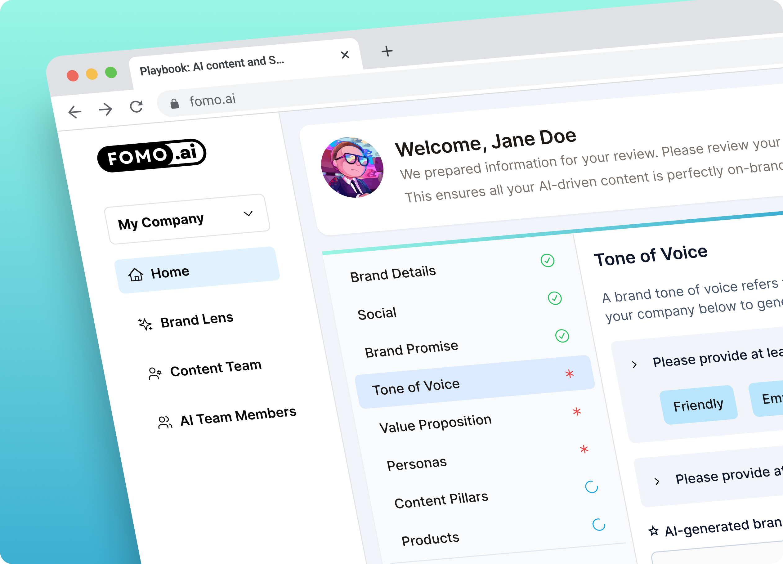
That third pattern came up directly in our work with FOMO.AI, a marketing platform that automates SEO and content creation. Users were spending 10 to 12 minutes on a critical first step -- keyword generation -- before they had seen a single result. The redesigned experience introduced a dual-mode system: a Simple Mode for users who wanted fast, streamlined output, and an Advanced Mode for users who wanted finer control. The result was a projected reduction in task completion time from 10 to 12 minutes down to 3 to 5 minutes. Read the full FOMO.AI case study to see how the flow was restructured.
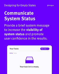
2. Empty States That Actually Do Something
An empty state is not a problem to solve -- it is a design surface to use. Most products treat empty states as edge cases and ship a generic "nothing here yet" illustration. That is a missed opportunity.
Every empty state in your product is an onboarding moment in disguise. It is the exact second when a user has arrived somewhere, found nothing, and is deciding whether to do something about it or close the tab. Design for that decision.
Effective empty states do three things:
They tell the user why nothing is there yet, in plain language. They show the user exactly what will be there once they take action. And they give the user a direct, specific call to action -- not a link to documentation, but a button that starts the action required.
For data-heavy SaaS products, consider using sample or demo data to pre-populate the state. Seeing a realistic version of a full dashboard is far more motivating than seeing a skeleton. Let users explore the product with realistic scaffolding before their own data is in place.

3. Dashboard Hierarchy That Reflects How Users Actually Work
The most common SaaS UI UX design mistake at the dashboard level is building the layout around what is technically available rather than what users need to act on. Product teams organize by data model. Users think in terms of tasks and priorities.
That disconnect shows up in dashboards that have eight equal-weight modules, no clear hierarchy, and no obvious answer to the question: what should I do next?
A few principles that fix this:
Lead with status, not data. Users open a dashboard to understand where things stand. Lead with the answer to that question. Put performance indicators, alerts, and task counts above the fold. Push historical charts and detailed breakdowns below.
Surface decisions, not just information. A dashboard that tells a user something is wrong without offering a path forward creates anxiety without resolution. Pair status indicators with contextual actions. If a metric is below threshold, show the action that addresses it.
Reduce visual competition. When everything on a dashboard has the same visual weight, nothing registers as important. Establish a clear hierarchy: one primary metric or status indicator at the top, secondary data in a supporting layer, and tertiary detail accessible but not prominent. If your dashboard passes the squint test (step back and squint -- can you tell what matters most?), the hierarchy is working.
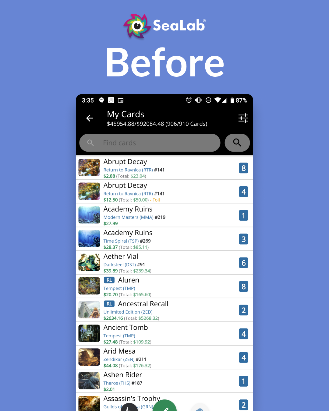
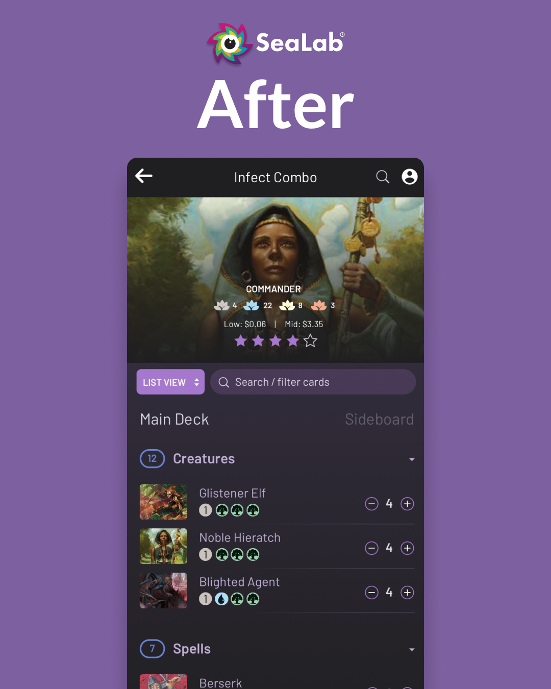
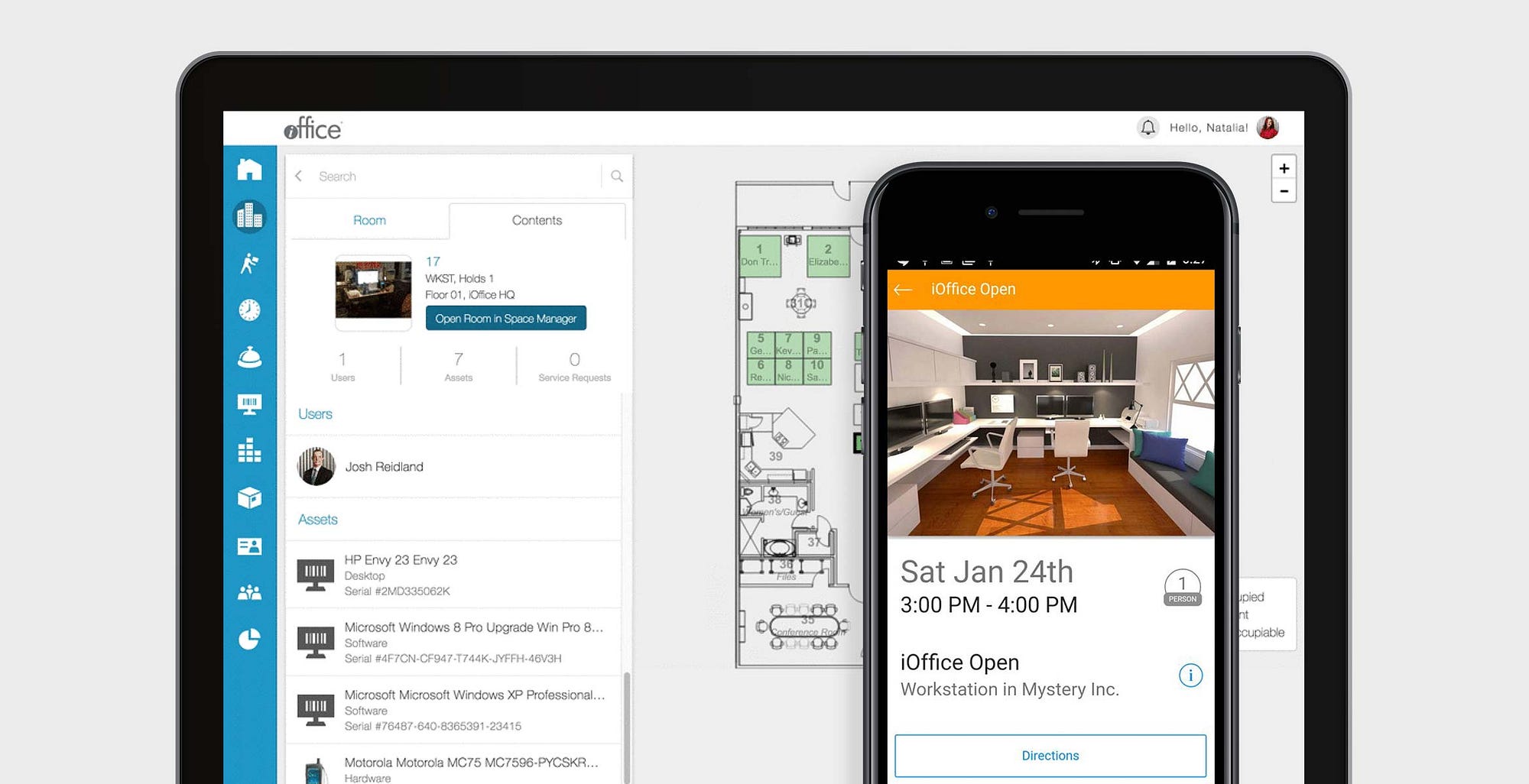
In the iOFFICE Hummingbird project, one of the central challenges was that the mobile and desktop versions of the same product had developed entirely different layouts and navigation logic over time. The desktop had a complex map interface; the mobile had a dashboard page that did not exist on desktop at all. By going screen by screen through every possible user flow and identifying which actions users needed most and how often, SeaLab was able to establish a unified navigation hierarchy that worked across both platforms. See the full iOFFICE case study for detail on how that process worked.
Before design
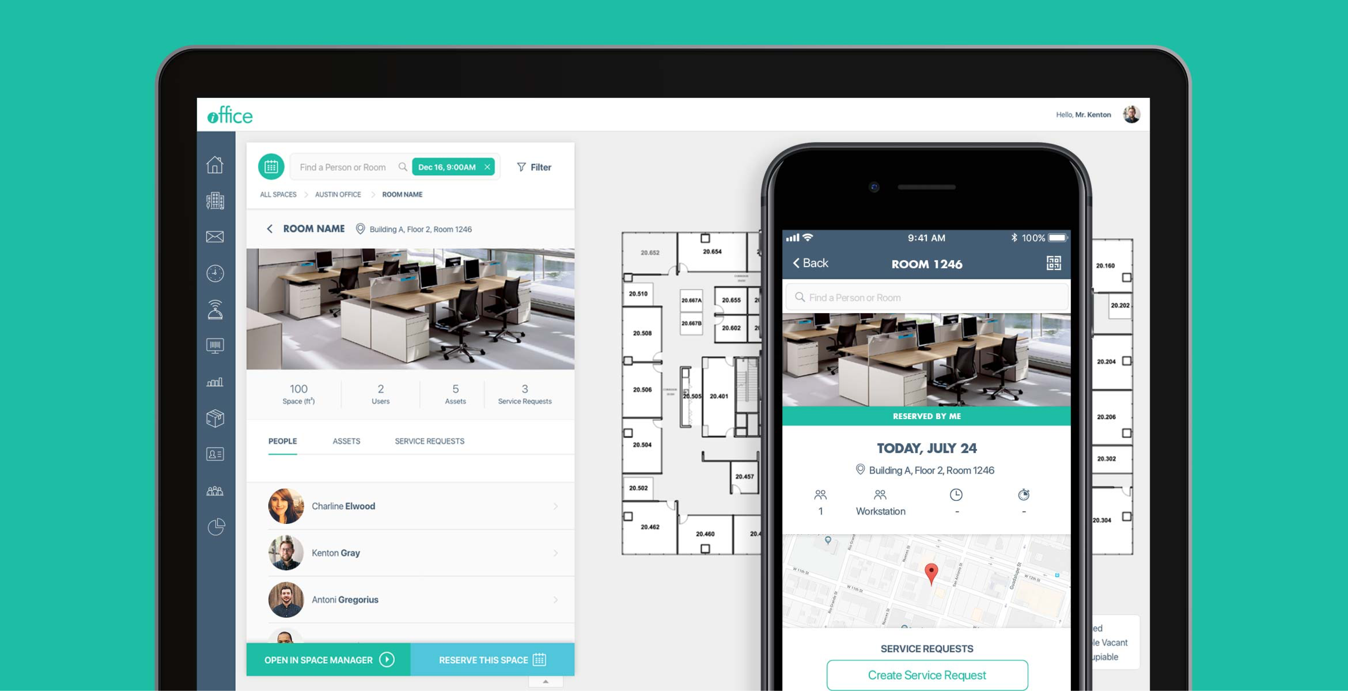
After redesign
4. Settings Architecture That Does Not Bury Critical Controls
Settings are where good SaaS UX goes to die. The pattern is always the same: settings start organized, then grow for years as features get added, and eventually become a junk drawer of unrelated controls grouped by when they were shipped rather than by how they are used.
Users who cannot find a setting they need will either give up, contact support, or decide the product is too hard to manage. None of those outcomes is good.
The fix is not a redesign every two years. It is a structural approach from the start:
Group settings by user goal, not by technical category. "Notifications," "Integrations," and "Billing" are goal-oriented categories. "Advanced," "System," and "Misc" are not.
Distinguish between account settings and product configuration. These are different things that users access at different points in their workflow. Mixing them creates confusion. Account settings (profile, billing, team members) belong in one place. Product configuration (how the tool behaves, defaults, data sources) belongs somewhere else.
Expose the settings users need most. If there is a setting that users frequently need to find and change, it should not be buried three levels deep. Surface high-frequency controls in context -- next to the feature they affect -- rather than forcing users to leave their workflow and navigate to a settings page.
5. Sub-Navigation and Breadcrumbs for Complex Multi-Step Flows
In products with deep, multi-step workflows -- approvals, campaign creation, project setup, multi-phase configuration -- users lose orientation. They do not know which step they are on, how many steps remain, or how to get back to where they were without starting over.
This is one of the most consistent sources of drop-off in SaaS products, and it is almost always fixable with good sub-navigation design.
The FOMO.AI redesign is a clear illustration. Users were getting lost in the keyword generation workflow because there was no reliable visual indication of where they were in the process or what came next. SeaLab introduced a sub-navigation system paired with breadcrumb trails, combined with step highlighting that visually emphasized the current stage and marked which steps had dependencies. The result was a flow that users could move through with confidence -- and one where they could quickly reorient themselves if they needed to step away and return.
The pattern applies broadly: any workflow with more than three sequential steps benefits from a persistent navigation indicator that shows progress, labels the current stage clearly, and provides a path back without losing work.
6. Reducing Steps to Core Actions
This is the most direct lever on retention, and the one that teams most often underestimate. Every unnecessary step between a user and their most-needed action is a place where that user can decide the product is not worth it today.
The iOFFICE Hummingbird project quantified this clearly. The original mobile application required up to five steps to complete a room reservation, which was the core action users performed daily. The redesigned experience brought that down to as few as three taps -- a 66% reduction in the minimum number of steps for the most common task in the product. That kind of improvement does not just improve satisfaction scores. It changes how reliably users build the product into their routine.
To find these opportunities in your own product, start with your highest-frequency user actions. Map every step required to complete each one, including the clicks, form fields, confirmation dialogs, and page loads that might not be obvious when you are inside the product every day. Then ask which of those steps are doing real work and which exist because of how the system was built rather than what the user needs.
Most products have at least one core flow that could be cut from five steps to two or three. That reduction is often the difference between a habit and a product users forget to re-open.
Where This Work Fits in a Product Ops Practice
None of these patterns require a full redesign to implement. Most of them can be addressed one flow at a time, starting with the area of highest impact. That is exactly how SeaLab approaches this kind of work -- not as a ground-up overhaul, but as a targeted intervention in the flows where friction is costing you the most.
If you suspect your retention problems are rooted in the experience rather than the feature set, a UX audit for SaaS products is the fastest way to find out where the real problems are. And if you already know which flow is broken and need it fixed, we built the Single Flow Rescue exactly for that.