Main Problem Overview
Panzura, an enterprise data management company based in Campbell, CA approached SeaLab with a challenge in early 2018: create, from scratch, a modern-style enterprise-facing brand and its respective user interface for a proof of concept software offering. The result, called “Vizion.ai”, would be capable of handling multi-cloud data management within the Panzura enterprise offering and would be introduced at VMworld in August of 2018.
With a forward-thinking mindset, SeaLab was brought on board to give the Vizion.ai MVP an approachable and modern feel while still grandfathering in recognizable parent brand style guide items for MVP launch — namely the Panzura iconic blue as well as Panzura language and general navigation layout stemming from a Bootstrap theme to be built upon.
Problem #1: How to create, hand off, and oversee the implementation of a fully comprehensive design library including branding in such a tight deadline while still adhering to all restrictions from the parent brand.
Problem #2: How to create an approachable and intuitive experience for a unique niche of enterprise customers and to repeat this experience for administrators on the backend of the system.
Project Goals and Objectives
After internal discussions with the SeaLab team, Panzura and existing Panzura customers, we identified a few objectives to make our sprints successful:
- Create a desktop-first experience that is consistent with modern web usage standards.
- Identify customers’ and internal administrators’ pain points and processes to become familiar with their challenges and identify opportunities for improvement.
- Familiarize ourselves with the parent company Panzura’s software, branding, and customer base.
- Construct a completely new brand for Vizion.ai that is both cutting edge and modern, while also rooted in the knowledge of the existing Panzura ecosystem. Where appropriate, include delighters such as animations and illustrations.
- Maintain the look and feel after MVP launch for both front-facing customers and back end administrators, identify and note repeating elements in the interface within a universal component library/style guide to be reused as the software and user needs grow.
- Manage implementation order and timeline — Provide a project manager role to make sure tickets are knocked out in the proper order. Also necessary to be available to developers to make design and interface changes on the fly as new situations and user interfaces arise.
- Meet and exceed a strict deadline by completing all of the above before the launch date of VMworld on August 26th, 2018.
Exploring The Existing Landscape
We began our journey by identifying the similarities and differences between Panzura and Vizion.ai and their retrospective target customers. While the Vizion.ai brand was hoping to capture a different niche audience than Panzura, we were able to gain a lot of insight into existing Panzura customers’ pain points and identified a few opportunities for improvement in the creation of the future Vizion.ai software.
Due to the tight timeline, we streamlined our research phase with end customers as much as possible and heavily leaned upon internal guidance from Panzura employees/executives to help keep us on the right track throughout our journey.
Knowing Panzura wanted Vizion.ai’s visual identity to be fleshed out as soon as possible, we spent time researching Vizion.ai’s target market, their competition, and the general landscape of what already existed out there to make sure we carved out a unique brand and also hit the right tone and style for Panzura’s vision. We achieved this by visiting competing brand’s websites and software and building a visual landscape of what the existing branding and marketing look like for companies under the same umbrella. Invision was invaluable for this step — it allowed us to capture our visual landscape at a glance all on one page. From here we worked with the Panzura executives to pick our favorites and made sure to note and avoid certain colors and color palettes that were already oversaturated in the market.
With visual identity research complete, our next step was to take a look at Panzura’s desired rollover elements; specifically their desire to continue to use a specific Bootstrap theme and navigation layout to be built on top of, as well as their desire to include their Panzura blue in the brand colors.
From all this research, we successfully identified our parameters to work within, concluded our initial research phase, and moved forward to our next step.
Creation Of Initial Low-Fidelity Designs (graceful-degradation/desktop-first approach)
Once our target market and brand landscape were well defined through a thorough competitive research process, we jumped into identifying and creating an initial style guide to be referenced by development as initial screens were built.
Every project is different and comes with its own unique constraints and Vizion.ai was no exception. The tight timeline required development to work in parallel alongside SeaLab so we adapted our process to make sure we did everything we could to create the best experience for Vizion.ai end customers while also adhering to the timeline restrictions.
First, knowing we were using and building off of a Bootstrap theme, we were able to create an initial style guide and color palette for development to use to implement early interfaces. We had some early discussions with the development team to make it clear these styles would change once we were able to spend dedicated time on the visual identity of Vizion.ai, however by creating this initial style guide (with the Panzura blue heavily referenced as a call to action color) we were able to satisfy executives desire for early implementation to look familiar and sharp.
Second, without the time necessary to have full user testing between each flow's creation, we used Adobe XD as our main design tool so we could easily flip between interface details and clickable prototypes/video development to be shared for feedback quickly through Slack channels and email.
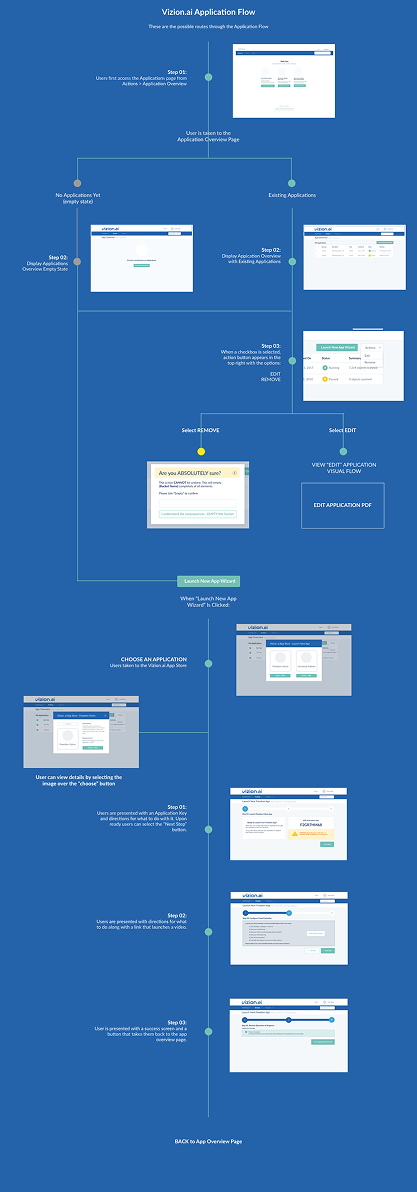
Third, since we were only given a few flows at a time to create, we chose flexible and familiar interface patterns that could be re-used throughout the Vizion.ai ecosystem effectively without sacrificing usability or uniform look and feel. For example, data entry is necessary throughout the interface so knowing this is a desktop-only interface, we designed the system to launch a modal for form entry to allow for the flexibility of a form requesting 2 inputs of information, or 25, while maintaining the look and feel.
Lastly, SeaLab requested and was given access to the staging site as well as Panzura's JIRA board to help with quality assurance throughout our timeline together. This allowed SeaLab to not only help maintain the implementation of the initial look and feel but also to make design changes as needed quickly and on the fly as user challenges and edge cases arose throughout development. Additionally, this allowed SeaLab to spend less time designing descriptive overlays on mockups with development requirements such as text size and padding. Instead, SeaLab could focus on creating a comprehensive design library covering those small design details and could help clarify those details and iron them out without development waiting on SeaLab to hand over the specific design requirement documents.
Our biggest challenge was tempering our client's desire to flesh out the home page and advertising pages right out of the gate, as we knew the branding would take more time to fully flesh out, and we wanted to know more about the full capabilities and general flow of the application before diving into creating Vizion.ai's face.
High-Resolution Visual Design and Branding Creation
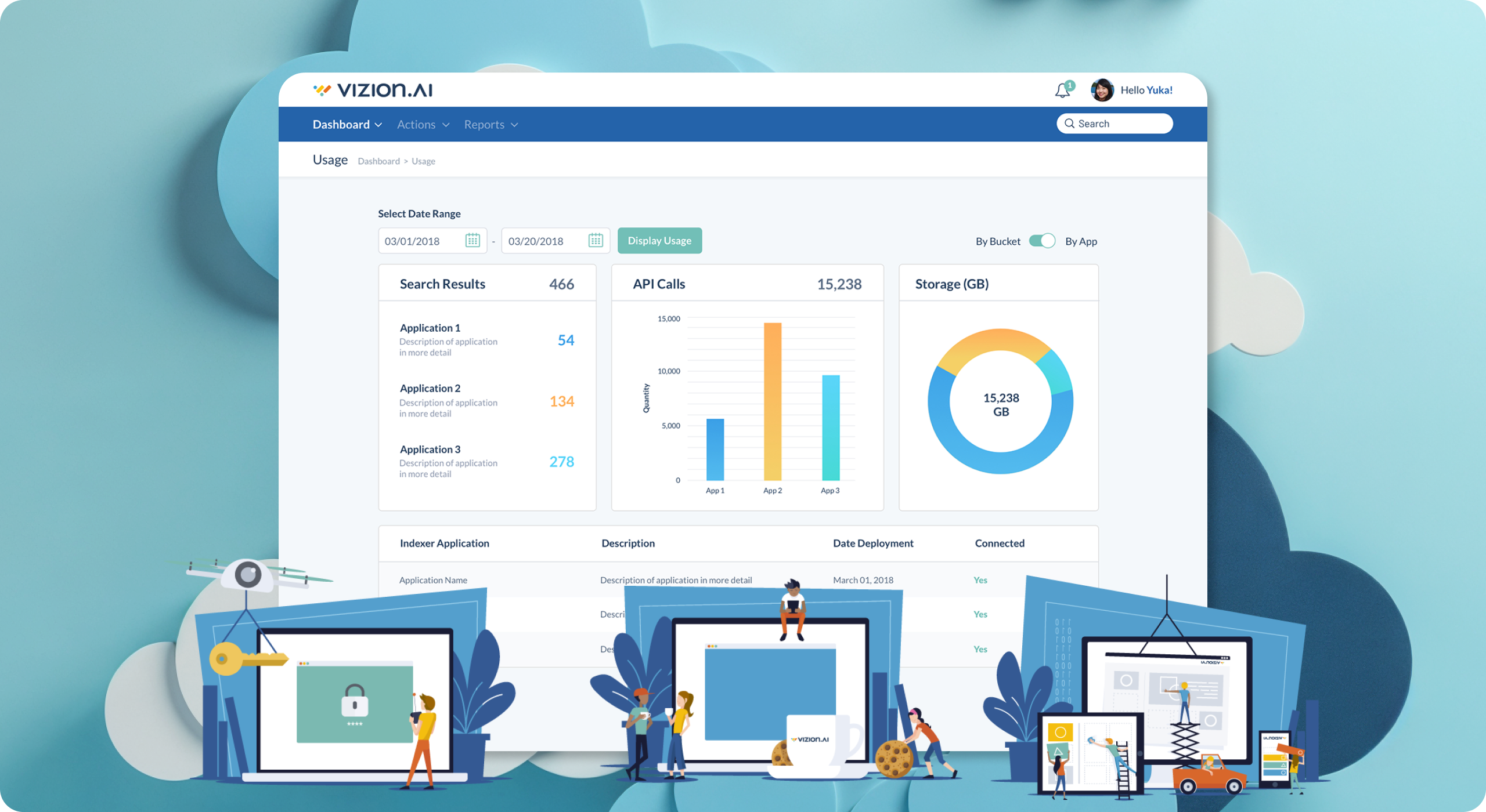
As our initial flows were fully handed off and moved into development, SeaLab gained some time to spend on Vizion.ai's branding. Knowing the software would contain a dashboard interface heavy with graphs for viewing data visually, we wanted to make sure Vizion.ai had a large color palette to keep the dashboard alive and interesting. From our research we know that a lot of blues and greens and grays are used in the industry currently and we knew Vizion.ai was hoping to be "modern" and more "approachable" than existing options, so we wanted to find a color palette with some lighter and warmer hues that go well with the main Panzura blue already being added to the user interface(UI).
From our visual landscape Invision document created in the research phase, we began adding additional explorations focusing on color palettes as well as logos. Google was a big inspiration, as they have lots of different child products each with their own "color". We also used Dropbox, and Slack as inspiration as well.
Having carved ourselves a chunk of time needed for proper back and forth, we were able to revert to our usual branding process, creating initial concepts in sketch form, sharing them for feedback, playing with more concepts, vectorizing chosen ideas in black and white, sharing them for feedback etc. After a few back and forth rounds we found ourselves with an identity that we all loved, from the SeaLab team to the Panzura executive level.
-
Typography: We chose a thicker, rounded-off sans-serif typographic family called Omnes that is both modern and approachable, yet hefty enough to be taken seriously for an enterprise brand. We also flipped the "V" to make the "A" of the .ai and to give the brand additional power and send the ".ai" portion of the brand home.
-
Color: We wound up with a palette of 8 total colors, most of which would be used in graphs throughout the interface so as to keep the UI nice and clean. Our visual language has a wide array of shades, several blues, a teal, and a yellow and orange that balance each other out well with the teal being our main call to action, keeping our colors focused and communicative throughout.
-
Symbol: After much back and forth we went with an abstract symbol loosely mimicking Vizion.ai's "V" in motion. This was heavily inspired by Vizion.ai's dashboard goals with multiple graph's data being represented visually.
-
Illustrations: To finalize the face of Vizion.ai and send home the approachability aspect, we spent some time creating a few custom illustrations to be used in onboarding screens, welcome screens, error screens, and empty screens. This brought our complete color palette to life and tied the bow on Vizion.ai's visual identity.
Once all of this was approved, SeaLab was able to shift gears into project management mode and quickly communicate the changes through an updated component library and Bootstrap style guide, and provide real-time guidelines to the team for where to implement the completed illustrations.
Quality Assurance and Triple Checking Everything
As VMworld approached, the need and deadline to create new things came and went and SeaLab's job became quality assurance, checking and keeping in close contact with developers to answer questions, and making sure the interface stayed looking sharp.
Wherever possible, updates were made to the component library for overall updates, and when needed, specific design tweaks would be made of varying items throughout.
At this point, a daily task for SeaLab was to triple check for bugs and handle requests for lower priority delighters such as animations once all bugs were worked out. Development constantly maintained that they were happy to have us there initiating small changes that made a huge impact, such as padding, body typography size, line height, hover effects, and so much more. It was a delight to work alongside implementation so closely and watch Vizion.ai come to life before our eyes.
Final Result
-
Reached The Tight August VMworld Deadline Successfully.
Vizion.ai's MVP was successfully conceptualized, designed, implemented, and revealed complete and on time at VMworld in August on 2018. Here they gained valuable feedback for the system and the brand in general, and it became clear that the modern spin on an enterprise software offering paid off. -
Produced a Custom Vizion.ai Visual Design Language To Successfully Stand On Its Own.
Thanks to extensive research into the competitive landscape as well as Panzura's internal style guidelines, Vizion.ai's colorful and illustrative visual language and branding stands fittingly next to its enterprise competition in a unique but integrated way. -
Future-Proofed Vizion.ai and Later Updates Through the Creation and Hand-off of a Comprehensive Component Library.
SeaLab spent time painstakingly documenting design guidelines for approved components alongside Vizion.ai's creation so that development and implementation could continue forward as client features were requested and the brand grows. Vizion.ai's ability to stand on its own and grow without the ongoing need of SeaLab's design team marks our success in this area. For another enterprise product case study with similar design system and brand challenges, see our UX redesign of iOFFICE Hummingbird across mobile and desktop. -
Created an Intuitive Interface That Simplified Complex User Problems.
Based on customer feedback, the clean interface with illustrative examples and onboarding steps helped simplify complicated questions and problems in Vizion.ai by introducing users to the interface at a comfortable pace. Users who were not familiar with enterprise cloud management were given a friendly introduction to the concept in an easily digestible way.