Showcase image of various Fomo.ai final designs stacked on top of each other in a pretty way
Who’s FOMO.AI and Why SeaLab Design?
FOMO.AI is a marketing platform built to help users thrive in an AI-driven world. Powered by a proven playbook developed through working with hundreds of brands and over $1 billion in media spend, FOMO.AI automates high-impact marketing activities like SEO and content creation. As SeaLab’s Senior Product Designer, I could help FOMO.AI make it easier for users to activate evergreen marketing programs that deliver real results with minimal effort. No fluff! Just useful, human-rated output.
The Problem
Users were spending 10–12 minutes navigating the dashboard and completing the process of keyword generation, a critical first step in the content marketing journey. This friction discouraged continued use and reduced the platform’s effectiveness in helping users generate value quickly.
Our Goal
Redesign the dashboard experience to streamline the keyword creation process and reduce the average task time from 10–12 minutes down to 3–5 minutes, without sacrificing clarity or functionality.
Joining the FOMO.AI project as their Senior Product Designer, we had a clear mission: reduce friction in the keyword generation workflow and improve the overall usability and scalability of the dashboard for new and existing users.
Our Game Plan
Research: Collecting user insights
The project owner provided a rich foundation of user research-including session recordings and interaction data-that revealed key user pain points. These insights were invaluable in showing where users hesitated, became confused, or took too long to complete tasks, especially around keyword input and navigation.
Planning: Analysis and Prioritization
We analyzed these recordings to pinpoint moments of cognitive load and drop-off. This informed a priority list of UX improvements based on:
- Task delays
- Confusing interactions
- Visual hierarchy breakdowns
Our Design Process
Created low-fidelity wireframes in Figma to quickly iterate layout changes and test conceptual flows. For a deeper look at how we approach prompt and agent design for AI products, see our conversational AI agent engineering case study.
Evolved those into high-fidelity mockups in Figma aligned with the FOMO.AI brand.
Redesigned dashboard components to simplify the user journey and reduce time-to-task.
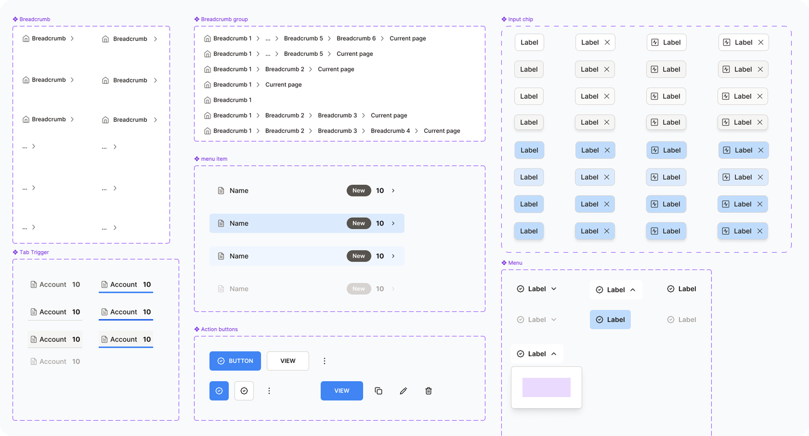
Design System Improvements
In parallel, we enhanced the existing design library to ensure consistency, improve scalability, and speed up future design sprints. For our broader thinking on building ethical, trustworthy AI products, see our framework for designing AI the human way. This work included:
Standardizing buttons, input fields, and modal behavior
Updating color styles and spacing tokens
Creating reusable templates for common dashboard layouts
Project Challenges
The redesign needed to strike a careful balance: simplify the experience for new users while retaining and expanding the platform's rich functionality for power users. This required solving multiple, layered design problems:
Flow Optimization: Reduce the complexity of the keyword generation process while maintaining advanced features.
End-to-End Guidance: Users often felt lost or unsure of next steps. I needed to design a flow that clearly guided users from onboarding to keyword creation to results.
Step & Status Clarity: Improve the visibility and understanding of which stage the user is in, what's completed, and what comes next.
Mode Flexibility: Introduce a dual-mode system which included both Simple Mode for fast, streamlined keyword generation and Advanced Mode for users who wanted more control and customization.
Navigation Overhaul: Create a cleaner, more intuitive dashboard layout that supports both linear and flexible user paths.
Async Collaboration: The project was executed entirely asynchronously. I worked closely with stakeholders via Loom video feedback and shared Figma updates, requiring clear communication and fast iteration without live meetings.
Solutions
To address the complexity and lack of guidance in the user flow, we implemented a series of focused UX improvements aimed at clarity, usability, and scalability.
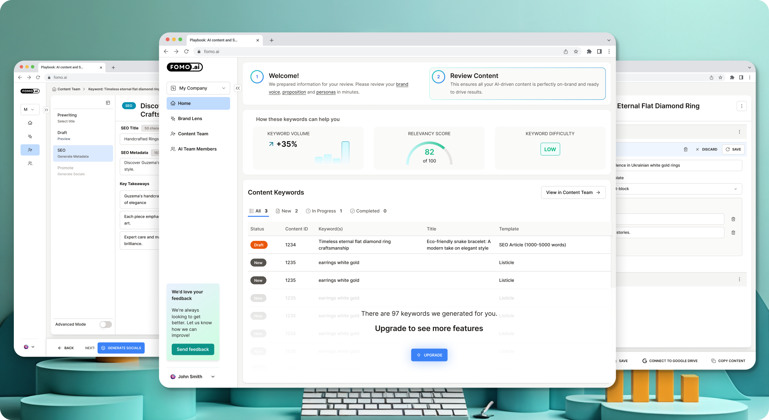
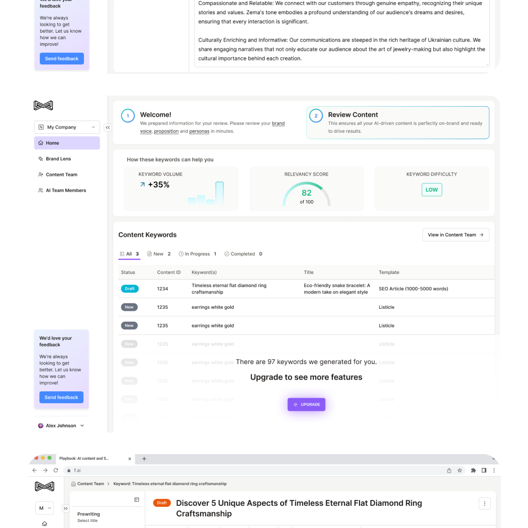
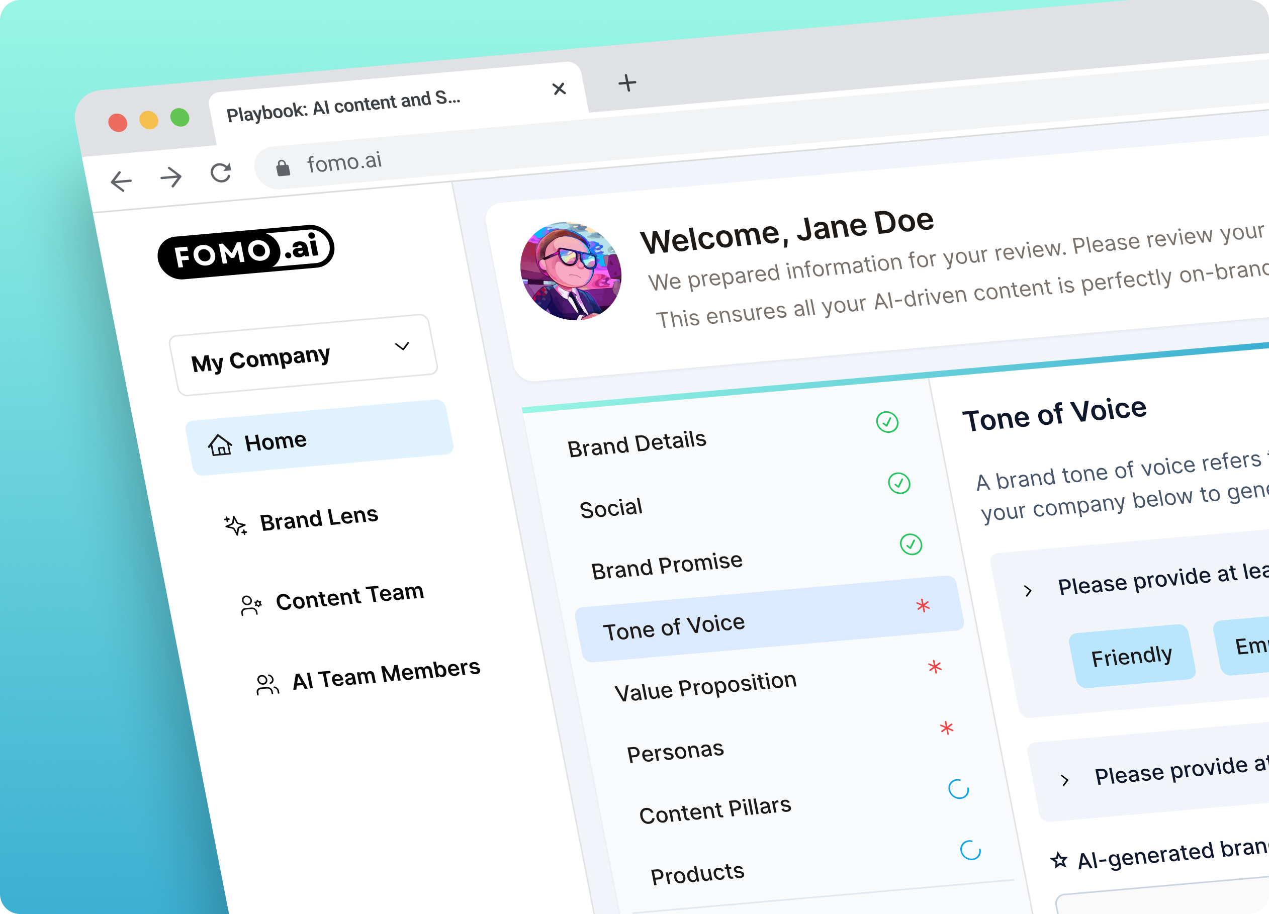
Sub-Navigation & Breadcrumbs: Introduced a clear sub-navigation system paired with breadcrumb trails to help users orient themselves in the flow. This improved process visibility, making it easy to understand the current step and what's coming next.
Step Highlighting & Prioritization: Key steps were visually emphasized, and dependencies were marked to guide users on what needed to be done first. This eliminated confusion and helped prevent users from skipping crucial parts of the process.
Simplified Editor Page: Designed a clean, focused editor interface that allowed users to clearly see the structure of their content and make real-time improvements. The editor supported both clarity and productivity.
Toolbar & Navigation Enhancements: Refined the dashboard layout and action toolbars to surface relevant controls without overwhelming the user. Each mode (Simple and Advanced) had tailored options, allowing users to work in a way that matched their skill level and goals.
Results
While the redesigned experience is currently being implemented, early feedback from key stakeholders has been overwhelmingly positive. The improvements to flow, navigation, and editor clarity are expected to significantly reduce user time on task-from 10-12 minutes down to the 3-5 minute target-while providing a more intuitive and scalable experience across user types.
"Work is fantastic and the whole company really thinks this will elevate our product experience. It is a strong base to build on top of, and a lot of the design system you made is pretty reusable across the app. I enjoyed working with you and appreciate that we were very flexible in terms of feedback, iteration, and working async.".
— Josh Niederriter, Co-founder FOMO.ai
The design system improvements and dual-mode architecture (Simple/Advanced) laid a foundation that the team can continue to build on for future features and refinements. For another example of building a reusable design system for an AI-powered SaaS product at speed, see how we designed the Goods CPG platform from scratch across 14 user flows.